Chapter 14 Paired t-Test
When we conduct a statistical test looking at group means we want to detect a difference in the group means if there really is a difference. One of the things we can do to increase our ability to detect a difference if there really is a difference is to take advantage of extra information in the data structure. One example of this type of extra information arises when we have so called `before and after’ measurements, repeat measurements from specific locations, or measurements that are in someway linked.
For example, say we are interested in understanding the effectiveness of a blood thinning drug. To test drug effectiveness we could obtain one set of measurements from 20 people that have not taken the drug and then another 20 measurements from 20 different people that have taken the drug and use a two-sample t-test to look for differences in mean blood clotting time. An alternative approach would be to take 20 measurements on blood clotting time from 20 people; then administer the drug to these same 20 people and take a second measurement on blood clotting time after the drug has been administered. Such a data set does not represent two random samples. Rather, the data set consists of observation pairs.
Although the context of a measurement before and after a treatment is the clearest example, there are many scenarios where it is possible to obtain data pairs. For example, if we send the same mineral sample to two different labs we end up with a `pair’ of measurements on the sample from different labs, not two independent observations. Similarly, if we ask husbands and wives a common set of question about happiness it might be appropriate to treat the husband and wife observations as pairs rather than independent observations.
Conceptually, the approach of obtaining observations pairs works to reduce sampling variability, or uncontrolled variation in the data sample. A reduction in uncontrolled variation (sampling variability) in the data set increases our ability to detect differences when differences exist.
14.1 Example with Wide Format Data
In this example we will be looking at before and after data from a contaminated site. Groundwater at the site was remediated using a Pump & Treat method with the intention of removing unacceptable levels of Total Petroleum Hydrocarbons (TPC). TCP is a general term encompassing hundreds of hydrocarbon based compounds. The paired measurements, recorded in micrograms per litre, were taken at observation wells around the contaminated site before and after the treatment.
We would like to determine whether the treatment has been effective - whether the differences between measurements before and after are different. To do this we will need to read in our data and calculate the differences between the two paired measurements so we can then create a boxplot, scatter plot, or histogram of these differences. From the plot we should have an idea of what the results of our formal statistical test will be. We will then run a formal paired t-test on the data. To reinforce how the paired t-test works we will also show how a paired t-test is the same as a One Sample t-test on the difference series.
We will show how to create a plot title with two lines. This is done either by adding \n where you want the separation between the lines, or by pressing “enter/return” for a new line in your script (see below). We will illustrate the \n approach. As you become more confident with plotting, how to put text on two lines is a good trick to know.
Generally you will read the data in from an MS Excel .csv file or similar, but here we input the data directly to provide a complete record of values.
# read in our data (wide format)
TPH.remediation<- data.frame(
  before= c(1475.7, 1292.2, 1575.9, 1440.8, 1606.1, 1425.1, 1502.3, 1327.4,
            1526.4, 1422.4, 1540.4, 1550.2, 1544.7, 1630.1, 1454.4, 1398.0,
            1428.1, 1421.8),
  after= c(695.1, 706.1, 675.5, 706.6, 717.8, 729.4, 722.3, 668.2, 714.4,
           672.5, 665.8, 658.7, 694.6, 684.9, 704.2, 690.0, 702.0, 710.4))

# Look at the raw data
str(TPH.remediation)
#> 'data.frame':    18 obs. of  2 variables:
#>  $ before: num  1476 1292 1576 1441 1606 ...
#>  $ after : num  695 706 676 707 718 ...
summary(TPH.remediation)
#>      before         after
#>  Min.   :1292   Min.   :659
#>  1st Qu.:1423   1st Qu.:678
#>  Median :1465   Median :699
#>  Mean   :1476   Mean   :695
#>  3rd Qu.:1544   3rd Qu.:709
#>  Max.   :1630   Max.   :729
First, we want to create a plot. However, because we have paired measurements, we look at the difference between the series, and plot this difference. It is possible to specifiy the difference directly into the boxplot command. Also note that because we only have one group we use a horizontal boxplot.
# use \n for fine level control of where to split the heading text

with(TPH.remediation,boxplot(before-after,
col= "lightgray", boxwex= 1.2,
main= "Pump and Treat Groundwater Remediation of
Total Petroleum Hydrocarbons (TPH)",
xlab= "Differences in TPH (ug/L)", ylim= c(500,1000),
horizontal= TRUE)) 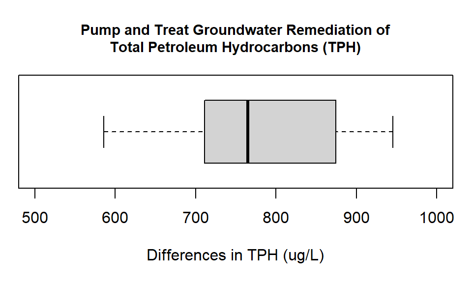
Figure 14.1: Box plot showing the differences in groundwater measurements of Total Petroleum Hydrocarbons (ug/L) at monitoring wells before and after pump and treat remediation.
Look at the way the difference has been calculated. We have subtracted the after measurement from the before measurement. When we look at the plot we can see that all the values are positive. This means that at every observation point the measurement after the intervention is lower. This is a good thing. For paired data, an alternative way to investigate the relationship is a scatter plot. The scatter plot approach is demonstrated in the advanced material.
From the boxplot (and our summary output) it looks like our remediation was successful. All the differences are positive, and if you have a look at the actual numbers again, all the measurements have dropped by around 50% from the original levels. We now conduct the formal paired t-test. For a paired t-test we do not conduct a variance ratio test. This is because the test works on the difference series, so there is only one series not two. As there is only one series we do not have two group variance values to compare.
14.1.1 Paired t-test using the paired t-test function
Step 1: Set the Null and Alternate Hypotheses
- Null hypothesis: The mean of the difference series is zero
- Alternate hypothesis: The mean of the difference series is not zero
- Null hypothesis: The mean of the difference series is zero
Step 2: Implement the Paired t-test Here we set a new parameter:
pairedto TRUE, as part of the t-test formula, and leave alpha at the default 0.05 level.with(TPH.remediation, t.test(before, after, paired = TRUE)) #> #> Paired t-test #> #> data: before and after #> t = 34, df = 17, p-value <2e-16 #> alternative hypothesis: true difference in means is not equal to 0 #> 95 percent confidence interval: #> 732 828 #> sample estimates: #> mean of the differences #> 780Step 3: Interpret the Results
From the output we see the p-value = < 2.2e-16, which we would generally report as \(<\) 0.001, which is smaller than 0.05. So, we:
Reject the null hypothesis that the means are equal.
Similar to other tests the output also provides the 95% confidence interval (732.4, 828 ug/L) for the actual difference, and reports the mean difference (780.2 ug/L).
In words we say we have sufficient evidence to say the concentration of Total Petroleum Hydrocarbons is lower after remediation was conducted (we know it’s lower from looking at the data values and boxplot).
That the remediation has had an impact is great news; but we still need to compare actual pollution levels to acceptable levels for the relevant land use. What if TPC levels needed to be, on average, below 800 ug/L? Our test does not answer this question. To answer that question we would need to conduct a one sample t-test on the after measurements, setting mu to 800. To find a statistically significant difference is one thing. To find a difference that is practically important is something else.
14.1.2 Paired t-test using the one sample t-test on the difference series
When we selected a paired t-test, R will automatically create a difference series to use, and apply the one sample t-test to the difference series. To check this we can manually create the difference series and then apply the one sample t-test directly to the difference series that we create. To create the difference series we will create the variable diff in the dataframe TPH.remediation by subtracting the after values from the before values.
# calculate difference between measurements
# this creates a new variable 'diff' in our data frame
TPH.remediation$diff<- TPH.remediation$before - TPH.remediation$after

# check what the data looks like after we have added the new variable
str(TPH.remediation)
#> 'data.frame':    18 obs. of  3 variables:
#>  $ before: num  1476 1292 1576 1441 1606 ...
#>  $ after : num  695 706 676 707 718 ...
#>  $ diff  : num  781 586 900 734 888 ...
summary(TPH.remediation)
#>      before         after          diff
#>  Min.   :1292   Min.   :659   Min.   :586
#>  1st Qu.:1423   1st Qu.:678   1st Qu.:715
#>  Median :1465   Median :699   Median :765
#>  Mean   :1476   Mean   :695   Mean   :780
#>  3rd Qu.:1544   3rd Qu.:709   3rd Qu.:868
#>  Max.   :1630   Max.   :729   Max.   :945
As we have created a difference series we can use this new variable directly to create a boxplot.\
with(TPH.remediation,boxplot(diff,
     col= "lightgray", boxwex= 1.2,
     main= "Pump and Treat Groundwater Remediation of
      Total Petroleum Hydrocarbons (TPH)",  # second line of title
     xlab= "Differences in TPH (ug/L)", ylim= c(500,1000),
      horizontal= TRUE))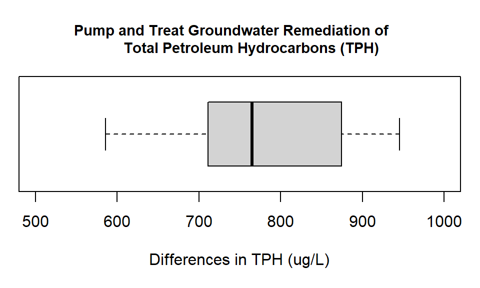
Figure 14.2: Box plot showing the differences in groundwater measurements of Total Petroleum Hydrocarbons (ug/L) at monitoring wells before and after pump and treat remediation.
Our Null hypothesis for the t-test is that the mean of the difference series is zero; our Alternate hypothesis is that the mean of the difference series is not zero. To implement this test we set mu=0 and leave alpha (conf.level) at the default value of 0.05.
with(TPH.remediation, t.test(diff))
#>
#>  One Sample t-test
#>
#> data:  diff
#> t = 34, df = 17, p-value <2e-16
#> alternative hypothesis: true mean is not equal to 0
#> 95 percent confidence interval:
#>  732 828
#> sample estimates:
#> mean of x
#>       780
Note that the one sample t-value output is the same as for the paired t-test. This is because we are conducting exactly the same test. We are also given the same confidence interval, and the mean difference between the paired values (780.2 ug/L) matches the mean difference value for the paired t-test. So, we have shown that a paired t-test is the same as a one-sample t-test on the difference series.
14.2 Advanced: Example with Long Format Data
For the paired t-test it is easier to have the data in wide format. Although the process for a paired t-test is nearly the same for long format data, it is not that easy to plot the data when it is in long format. Here we work through the process and introduce a new command, subset(). We use the subset() command to extract the data for each of our groups by specifying parameter obs with the character string (i.e. name) of the factor level (i.e. group) to select. We also use a double equal sign == to tell R to select for something exactly equal to the name we provide. Alternatively you can run a paired t-test directly on long format data (see below), but the most natural way to illustrate paired data is by plotting the differences in a histogram or boxplot, or the actual data via a scatter plot.
Our data here is paired (before/after measurements at the same location), but remember paired data can also be before and after measurements from the same subject, or a comparison of treatments or measurement methods applied to the same subject or site. Here we have measurements of percent coral cover from a reef before and after a marine heat wave. Prolonged and extreme heat stress are known to impact the symbiotic relationship between coral and algae living within its tissues. The algae are expelled causing coral bleaching and, in more severe cases, coral death. We will be testing whether coral cover has significantly changed since the heat wave.
# read in our data (wide format)
coral<- data.frame(
  cover= c(19, 20, 35, 13, 22, 26, 19, 31, 35, 29, 10, 31, 8, 20, 19, 15, 22, 19,
           10, 8), obs= c(rep("before", times =10), rep("after", times= 10)))

# subset to extract values for each group
coral.before <- subset(coral, obs== "before")
coral.after <- subset(coral, obs== "after")
# calculate differences (creates a new dataframe of just the differences)
coral.diff<- coral.before$cover - coral.after$cover

# get summary & structure and create a histogram of our differences
str(coral.diff)
#>  num [1:10] 9 -11 27 -7 3 11 -3 12 25 21
summary(coral.diff)
#>    Min. 1st Qu.  Median    Mean 3rd Qu.    Max.
#>   -11.0    -1.5    10.0     8.7    18.8    27.0
hist(coral.diff, breaks = 'fd',
     col= "lightgray",
     # write title on two lines (use \n or 'return' for new line)
     main= "Differences in Coral Cover
     Before and After a Marine Heat Wave",
xlab= "Differences in percent cover", las= 1) 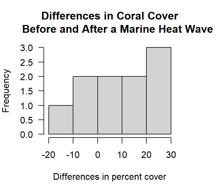
Figure 14.3: Histogram of the differences in paired measurements of percent coral cover from before and after a marine heat wave.
In this instance the histogram does not provide a strong visual cue. There are few data points and we have both positive and negative values. An alternative way of looking at paired data is to create a scatter plot with a \(45^\circ\) line. If the data set is in wide format the plot is easy to create. However, here we have to pull the observations from the two objects we created. If all the observations fall to one side of the \(45^\circ\) line it tells you something.
plot(coral.before$cover,coral.after$cover,
     col= "lightgray",
     pch=19,
     main= "Marine Heat Wave Effect: \n Coral Cover Before and After",
     xlab= "Before measurement",
     ylab= "After measurement",
     xlim = c(5,40),
     ylim = c(5,40),
     # cex.main=2,
     # cex.lab=1.5,
     # cex.axis=1.5,
     las= 1)
abline(0,1) #  45 degress line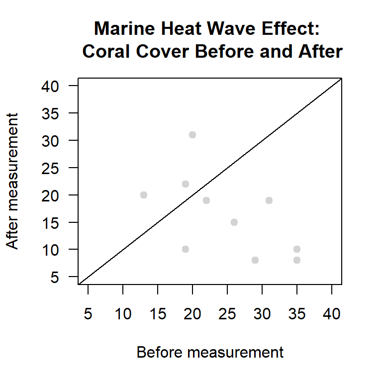
Figure 14.4: Scatter plot of paired measurements of percent coral cover from before and after a marine heat wave.
Here we see that seven out of ten of the dots fall in the before triangle. This means that in seven out of ten cases the coral cover was greater before the heatwave than after the heatwave. If the dots cluster around the \(45^\circ\) line the differences are likely to be due to random sampling effects. The further away the dots are from the \(45^\circ\) line the stronger the evidence of a difference. Here the dots in the after triangle are not that far from the \(45^\circ\) line, while many of the dots in the `before’ triangle are quite far from the \(45^\circ\) line. This suggests that the heatwave has had a negative effect, but it is something that we still need to check with a formal test.
Step 1: Set the Null and Alternate Hypotheses
- Null hypothesis: The mean of the difference series is zero
- Alternate hypothesis: The mean of the difference series is not zero
Step 2: Implement the Paired T-Test
Here we setpairedto TRUE, and leave alpha at the default value of 0.05. Note that for the t-test, because the data are in long format we use “\(\sim\)” rather than “,”with(coral, t.test(cover ~ obs, paired = TRUE)) #> #> Paired t-test #> #> data: cover by obs #> t = -2, df = 9, p-value = 0.07 #> alternative hypothesis: true difference in means is not equal to 0 #> 95 percent confidence interval: #> -18.155 0.755 #> sample estimates: #> mean of the differences #> -8.7Step 3: Interpret the Results
From the output we see the p-value = 0.06709, or 0.0671 is larger than 0.05. So, we:
Fail to Reject the null hypothesis that the means are equal.
Is this what you expected based on the plot?
For completeness we can also apply the one sample t-test directly to the difference series. Our Null hypothesis is that the mean of the difference series is zero; our Alternate hypothesis is that the mean of the difference series is not equal to zero. As always alpha is 0.05.
t.test(coral.diff)
#>
#>  One Sample t-test
#>
#> data:  coral.diff
#> t = 2, df = 9, p-value = 0.07
#> alternative hypothesis: true mean is not equal to 0
#> 95 percent confidence interval:
#>  -0.755 18.155
#> sample estimates:
#> mean of x
#>       8.7
If you compare the information in the one sample t-test to that in the paired t-test you will see that they are the same (you can ignore the difference in the sign on the t-statistic and the . This is because you are testing the same thing. But what about the result - what does it mean for the reef? Under our default alpha and 95% confidence interval the p-value is deemed not statistically significant. However, what if our alpha was 0.1 (90% confidence)? All of a sudden we have a significant result!
If the outcome of this research was to determine whether to implement a policy to better protect the reef, what would you decide? This is why there is much controversy surrounding the standard 0.05 p-value decision rule, and why it is absolutely essential that the context of your data and implications of research outcomes are taken into consideration.
The other thing to be discussed are the negative differences we noticed. Where could these have come from? A heat wave is very unlikely to have increased coral cover. By critically thinking about the results and data we might suggest that this is more likely due to other factors, such as sampling error or possibly some sort of measurement error. Seeing these results in this context might lead you to look deeper into sources of error and put less confidence in the results of your analysis. In other contexts, this result might be perfectly normal.