Chapter 10 Single Sample t-Test
The t-test is the most common statistical test in science, and also one of the most important. The test focus is the sample mean. Specifically, the test seeks to establish whether the sample mean is different from a specified value. The test provides information on whether it is relatively likely or relatively unlikely the specific sample we have could be a sample drawn from a population that has a mean equal to the hypothesis test value we specify. The t-test approach was devised by a beer brewer (W.S. Gosset, aka A. Student) at the Guinness brewery as he tried to control the alcohol content of beer. If the alcohol content of the beer was too high the brewery had to pay a lot of tax, and so made no profit. If the alcohol content of the beer was too low consumers switched to other products, and with low sales the company also made no profit. So, it turns out that beer is responsible for modern statistics. Go figure.
Provided the data sample is `reasonably’ large the t-test does not require that the sample data follow a normal distribution. If the data sample is small then it does matter whether the data sample is normally distributed or not. How to deal with small data samples that do not look normal is something that is covered in a subsequent handout.
There are many high quality text books and online resources that explain the theory of the t-test. The focus of this resource is on how the conceptual structure of a t-test and how to implement a t-test in R; not an explanation of the theory behind the t-test.
The test statistic for the t-test is calculated as the difference between the sample mean and the hypothesis test value (numerator), divided by the sample standard error (denominator). So we have
\[\frac{\text{[sample mean - mean under null hypothesis]}}{\text{standard error}}\].
As such, the test statistic will tend to be large when the difference between the sample mean and the null hypothesis test value is large and the standard error is small.
If the test statistic value is far from zero (large in absolute value terms) the conclusion drawn is that the sample mean is different to the null hypothesis value. If the test statistic is close to zero the conclusion drawn is that the sample mean is not different to the null hypothesis value. To determine what constitutes close to zero and what constitutes far from zero we use the p-value decision rule. For the t-test, the null hypothesis that the sample mean is not different to the null hypothesis test value is rejected when the p-value is small.
10.1 Preliminary Data Exploration
For this example we will use the Mauna Loa Atmospheric CO2 Concentration data set, co2. The data is a time series of monthly carbon dioxide concentrations at Mauna Loa, Hawaii, from 1959 to 1997. The data set is already installed with base R.
We want to know two things:
- Is the average CO2 concentration at Mauna Loa for the period 1959 to 1997 different from 338 ppm? At Mauna Loa, the average CO2 concentration for the entire 20th century as a whole was 338 ppm, so there is a logical reason for considering this test value.
- Is the average CO2 concentration at Mauna Loa for the period 1959 to 1997 different from 321 ppm? At Mauna Loa, the average CO2 concentration for the entire 19th century as a whole was 321 ppm; so again there is some logic in selecting this as a test value.
We will answer these questions by conducting single sample t-tests; but first, as will always be the case, we need to conduct an informal investigation of our data set to make sure we understand the nature of the data we are working with.
Let’s first look at the summary and structure of the data, and then create a histogram.
Note that the data structure information looks a little different to what you have previously seen. When we have data observations recorded through time there is a natural order to the data. The observations for 1960 should be listed after the observations for 1959, and the information we get with the str() command confirms this.
par(mar=c(5,4,3,4))
# get summary and structure

summary(co2) # gives us the 6 num. summary (mean, min, max, etc.) for the variable 'x'
#>    Min. 1st Qu.  Median    Mean 3rd Qu.    Max.
#>     313     324     335     337     350     367
str(co2)     # we have a time-series; [1 var and 468 obs] from 1959 to 1998
#>  Time-Series [1:468] from 1959 to 1998: 315 316 316 318 318 ...
temp.data <-as.data.frame(co2) # let me change the data set to be the same as typical
names(temp.data) <- c("co2")
# plot histogram
with(temp.data, hist(co2, col= 'lightgrey', border= 'black',      # set optional parameters
      main= "Histogram of Mauna Loa CO2 Concentrations",
      xlab= "CO2 (ppm)", xlim= c(300,380), ylim= c(0,80)))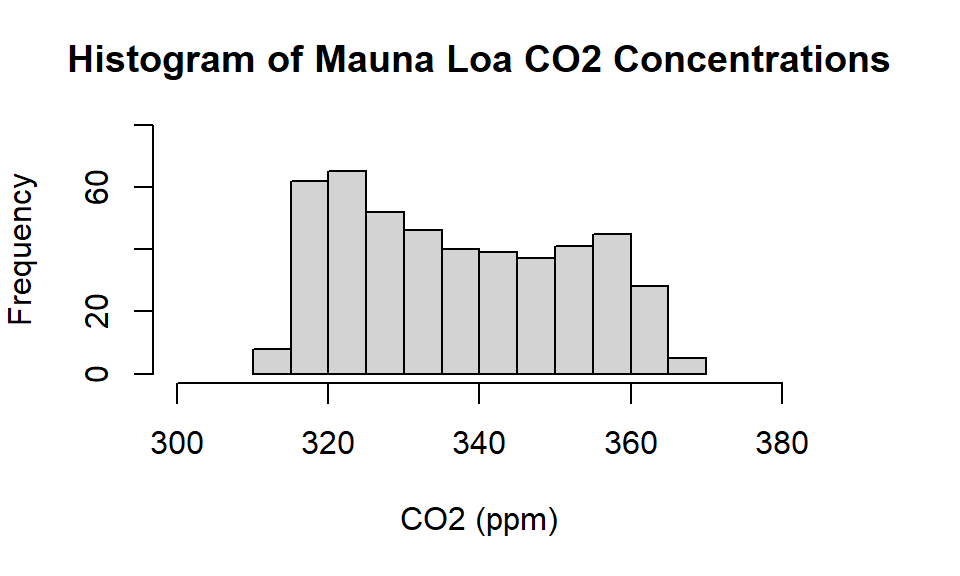
Figure 10.1: Histogram of Mauna Loa carbon dioxide concentrations between 1959 and 1997.
What shape does the histogram suggest? Does the distribution look normal, or maybe more like a uniform distribution? Remember, the t-test doesn’t rely on the sample data distribution looking like a normal distribution, if we have a reasonably large sample. Here we have lots of observations. Although there is no fixed rule \(>\) 30 observations is generally seen as meeting the requirement of a reasonably large sample. Here we have 468 observations.
Let’s go back to our two questions - is the sample mean statistically different from the mean carbon dioxide concentrations of the 19th and 20th centuries (321 ppm; 338 ppm). Where do these values fall in our distribution when looking at our histogram? Try and predict the outcomes of our tests based only on looking at the histogram and where these values lie. Recall that the numerator for the test statistic is the difference between the null hypothesis and the sample mean, which here is (337-338). If the difference between these two values is small then it is unlikely the test statistic will be far from zero.
If you have appropriately explored the data before conducting a t-test using visual techniques such as creating a histogram or a boxplot, you are unlikely to be surprised by the formal t-test result.
10.2 Conducting a One Sample t-test
10.2.1 Example: Fail to Reject the Null
From the data summary we know the sample mean is 337 ppm. We want to test whether 337 ppm is statistically different to the 20th century mean of 338 ppm. For this example we will test the claim that:
The average CO2 concentration for the period 1959 and 1997 is different to the century average.
Let’s go through the formal steps
Step 1: Set the Null and Alternate Hypotheses
- Null hypothesis: The mean is 338 ppm
- Alternate hypothesis: The mean is not 338 ppm
Step 2: Set the Alpha Level
The alpha level is the probability of rejecting the null hypothesis when the null hypothesis is true (Type 1 error)
We will always set this to 0.05 (5% chance of a Type 1 error) which is the default setting in almost all software programs. This is a topic that comes up in later guides, for the moment we just use the default for alpha.
Step 3: Implement the Single Sample t-test
To implement the test in R we use the function
t.test(). The default for alpha is 0.05 so we only need to set the parametermu, (for mean) to our Null Hypothesis value, which is 338 ppm.Note that when working with your own data file you may need to also use the command to specify which data file you are using before you apply the
t.test()command.
with(temp.data, t.test(co2, mu = 338))
#>
#>  One Sample t-test
#>
#> data:  co2
#> t = -1, df = 467, p-value = 0.2
#> alternative hypothesis: true mean is not equal to 338
#> 95 percent confidence interval:
#>  336 338
#> sample estimates:
#> mean of x
#>       337
Step 4: Interpret the Results
The first thing to check in the output is the test name. The output confirms we have the results for a single sample t-test. So we know we have implemented the correct test. Now consider the actual test output.
The p-value
From the output we see the p-value = 0.172. Since our alpha is 0.05 and 0.172 is greater than 0.05, we: Fail to reject the null hypothesis that the mean is 338 ppm.
What does this mean? It means, we did not have sufficient evidence to say the mean carbon dioxide level at Mauna Loa, between 1959 and 1997, is different to the mean for the whole 20th century. Is this what you expected from the histogram plot? What about the rest of the output? While it is possible to make a decision based on the p-value decision rule, the test output includes a range of other values, such as the t-statistic and the 95% confidence interval. In addition to the p-value, it is worth making clear the relationship between the different values reported in the test output.
The t-value
The reported t-value is the test statistic. The t-value for the test is -1.37. Formally, our test looks at whether or not the value -1.37 is close to or far from zero. We used the p-value information (p-value =0.17 to interpret the reported test statistic value and conclude that this value is not far from zero (do not reject the null). We can also generate this value manually.
Recall the test statistic formula is: \[\frac{\text{[sample mean - mean under null hypothesis]}}{\text{standard error}}\]. We know the difference between sample mean - null hypothesis value is \((337.05-338.00) = -0.95\), which is the numerator in the test statistic. We also know that the formula for the standard error (of the mean) is the sample standard deviation divided by the square root of the sample size. Using
sd(co2)we find the sample standard deviation is 14.97. The sample size is 486, and \(\sqrt{468} = 21.63\). The standard error is then \(14.97/21.63 = 0.69\), and the test statistic is found as $ -0.95/ 0.69 = -1.37$, which is the value reported in the output. Thankfully, we do not need to do these calculations by hand, but it is nice to know how the reported values are derived.The 95% confidence interval
The 95% confidence interval is (\(335.7, 338.4\)). The 95% confidence interval can be thought of as defining all values for a null hypothesis that will not be rejected. The 95% confidence interval can be derived as the sample mean value plus/minus the critical t-value multiplied by the sample standard error. However, for the moment we will ignore the specifics of the 95% confidence interval calculation and just focus on interpreting the 95% confidence interval as the values for a null hypothesis that will not be rejected. Using our p-value decision rule we concluded: do not reject the null. As the 95% confidence interval includes 338 ppm, our decision is consistent with the 95% Confidence Interval information.
Sample mean
We are also presented with the mean of our sample (337.1 ppm}), which, unsurprisingly is the same value as when calculated using the
summary()command.The logic check
Now, go back and have a look at the histogram. Do the results of the test make sense? The visual plot is part of the analysis, and you should expect the plot and your formal tests to be in agreement. If they are not, it is worth checking to see if you have made a mistake somewhere. This structured approach is a way to develop good habits.
10.2.2 Example: Reject the Null
Now we’ll test whether our sample mean of 337 ppm is different to the 19th century mean of 321 ppm. From the histogram we know that 321 is within our sample range of observations, but quite far from the mean. For this example we will test the claim that:
The average CO2 concentration between 1959 and 1997 is not different from the average of the 19th century.
Let’s go through the formal steps:
Step 1: Set the Null and Alternate Hypotheses
- Null hypothesis: The mean is 321 ppm
- Alternate hypothesis: The mean is not 321 ppm
Step 2: Set the Alpha Level
We will always set this to 0.05 (5% chance of Type 1 error), and it is the default value anyway.
Step 3: Implement the Single Sample t-test
Here we set the parameter
muto 321 ppm, which is our new Null Hypothesis value.
#>
#>  One Sample t-test
#>
#> data:  co2
#> t = 23, df = 467, p-value <2e-16
#> alternative hypothesis: true mean is not equal to 321
#> 95 percent confidence interval:
#>  336 338
#> sample estimates:
#> mean of x
#>       337
Step 4: Interpret the Results
Again, first check that the output relates to the test you wanted to implement. Here, we can see that yes, the results are for a single sample t-test.
The p-value
From the output we see the p-value = < 2.2e-16, or \(< 0.001\), which is smaller than \(0.05\). So, we:
Reject the null hypothesis that the mean is 321 ppm.A p-value less than 0.05 means we have sufficient evidence to conclude that the mean carbon dioxide level at Mauna Loa between 1959 and 1997 is different to the mean for the 19th century as a whole.
The t-value
The t-value for the test is 23.2, and we have concluded that this value is far from zero, hence the reject the null decision. Recall, to manually calculate the test statistic we use the formula: ([sample mean - null hypothesis value]/standard error). So we have: \((337.05-321.00) = 16.05\) as the numerator, and as with our earlier test we have \(14.97/\sqrt{468}= 0.69\) as the denominator. The test statistic is then: \(16.05/0.69= 23.2\), which is the value reported in the test output.
The 95% confidence interval
We can also see that the 95% confidence interval (\(335.7, 338.4\)) does not include 321 ppm. The 95% confidence interval defines potential null hypothesis values that we would not reject using a p-value decision rule threshold value of 0.05. As 321 ppm falls outside the 95% confidence interval we should expect that a p-value decision rule would lead us to reject the null.
The logic check
Go back and have a look at the histogram. In this instance we see that 321 ppm is towards the edge of the plot and so there seems to be consistency between the `feel’ we have for the data based on the plot and the formal test result.
10.3 Advanced: The p-value
P-value decision rules are controversial. The architect of the t-test – W.S. Gosset – had no time for such ideas; yet R. Fisher, another giant of the field, thought p-value decision rules a useful approach. The issues involved with these arguments are complex, and preferences for reporting standards vary across disciplines. The approach advocated in this handout is to combine a preliminary visual inspection of the data with a t-test that relies on a p-value decision rule. This might be thought of as a weight of evidence approach. If both the data visualisation and the formal t-test results (based on a p-value decision rule) agree, most reasonable people will be convinced of the result.
If you are a student in the latter part of your studies you may wish to consult the below references. The paper provides a relatively accessible treatment of the strengths and weaknesses of p-value decision rules. There are also many other papers that discuss these issues, and if you are going on to advanced study, it might be worth consulting some of this literature.
10.4 Advanced: Technical Details on Single-Sample \(t\)-test
We generally require a large sample for two reasons:
- The sampling distribution of \(\bar{x}\) tends to be more normal when the sample is large.
- The calculated standard error is typically very accurate when using a large sample.
So what should we do when the sample size is small? If the population data are nearly normal, then \(\bar{x}\) will also follow a normal distribution, which addresses the first problem. The accuracy of the standard error is trickier, and for this challenge we’ll introduce a new distribution called the \(t\)-distribution.
While we emphasize the use of the \(t\)-distribution for small samples, this distribution is also generally used for large samples, where it produces similar results to those from the normal distribution.
10.4.1 The normality condition
A special case of the Central Limit Theorem ensures the distribution of sample means will be nearly normal, regardless of sample size, when the data come from a nearly normal distribution.
While this seems like a very helpful special case, there is one small problem. It is inherently difficult to verify normality in small data sets.
caution Checking the normality condition
We should exercise caution when verifying the normality condition for small samples. It is important to not only examine the data but also think about where the data come from. For example, ask: would I expect this distribution to be symmetric, and am I confident that outliers are rare?
You may relax the normality condition as the sample size goes up. If the sample size is 10 or more, slight skew is not problematic. Once the sample size hits about 30, then moderate skew is reasonable. Data with strong skew or outliers require a more cautious analysis.
10.4.2 Introducing the \(t\)-distribution
In the cases where we will use a small sample to calculate the standard error, it will be useful to rely on a new distribution for inference calculations: the \(t\)-distribution. A \(t\)-distribution, shown as a solid line in Figure 10.2, has a bell shape. However, its tails are thicker than the normal model’s. This means observations are more likely to fall beyond two standard deviations from the mean than under the normal distribution.111 While our estimate of the standard error will be a little less accurate when we are analyzing a small data set, these extra thick tails of the \(t\)-distribution are exactly the correction we need to resolve the problem of a poorly estimated standard error.
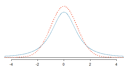
Figure 10.2: Comparison of a \(t\)-distribution (solid line) and a normal distribution (dotted line).
The \(t\)-distribution, always centered at zero, has a single parameter: degrees of freedom. The degrees of freedom (df) describe the precise form of the bell-shaped \(t\)-distribution. Several \(t\)-distributions are shown in Figure 10.3. When there are more degrees of freedom, the \(t\)-distribution looks very much like the standard normal distribution.
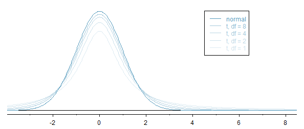
Figure 10.3: The larger the degrees of freedom, the more closely the \(t\)-distribution resembles the standard normal model.
When the degrees of freedom is about 30 or more, the \(t\)-distribution is nearly indistinguishable from the normal distribution. In Section 10.4.3, we relate degrees of freedom to sample size.
It’s very useful to become familiar with the \(t\)-distribution, because it allows us greater flexibility than the normal distribution when analyzing numerical data. We use a t-table, partially shown in Table 10.1, in place of the normal probability table. In practice, it’s more common to use statistical software instead of a table.
| one tail | 0.100 | 0.050 | 0.025 | 0.010 | 0.005 |
| two tails | 0.200 | 0.100 | 0.050 | 0.020 | 0.010 |
| \(df\) | |||||
| 1 | 3.08 | 6.31 | 12.71 | 31.82 | 63.66 |
| 2 | 1.89 | 2.92 | 4.30 | 6.96 | 9.92 |
| 3 | 1.64 | 2.35 | 3.18 | 4.54 | 5.84 |
| \(\vdots\) | \(\vdots\) | \(\vdots\) | \(\vdots\) | \(\vdots\) | \(\vdots\) |
| 17 | 1.33 | 1.74 | 2.11 | 2.57 | 2.90 |
| 18 | 1.33 | 1.73 | 2.10 | 2.55 | 2.88 |
| 19 | 1.33 | 1.73 | 2.09 | 2.54 | 2.86 |
| 20 | 1.33 | 1.72 | 2.09 | 2.53 | 2.85 |
| \(\vdots\) | \(\vdots\) | \(\vdots\) | \(\vdots\) | \(\vdots\) | \(\vdots\) |
| 400 | 1.28 | 1.65 | 1.97 | 2.34 | 2.59 |
| 500 | 1.28 | 1.65 | 1.96 | 2.33 | 2.59 |
| \(\infty\) | 1.28 | 1.64 | 1.96 | 2.33 | 2.58 |
Each row in the \(t\)-table represents a \(t\)-distribution with different degrees of freedom. The columns correspond to tail probabilities. For instance, if we know we are working with the \(t\)-distribution with \(df=18\), we can examine row 18, which is highlighted in Table 10.1. If we want the value in this row that identifies the cutoff for an upper tail of 10%, we can look in the column where one tail is 0.100. This cutoff is 1.33. If we had wanted the cutoff for the lower 10%, we would use -1.33. Just like the normal distribution, all \(t\)-distributions are symmetric.
Just like a normal probability problem, we first draw the picture in Figure 10.4 and shade the area below -2.10. To find this area, we identify the appropriate row: \(df=18\). Then we identify the column containing the absolute value of -2.10; it is the third column. Because we are looking for just one tail, we examine the top line of the table, which shows that a one tail area for a value in the third row corresponds to 0.025. About 2.5% of the distribution falls below -2.10. In the next example we encounter a case where the exact \(t\) value is not listed in the table.
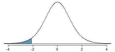
Figure 10.4: The \(t\)-distribution with 18 degrees of freedom. The area below -2.10 has been shaded.
We identify the row in the \(t\)-table using the degrees of freedom: \(df=20\). Then we look for 1.65; it is not listed. It falls between the first and second columns. Since these values bound 1.65, their tail areas will bound the tail area corresponding to 1.65. We identify the one tail area of the first and second columns, 0.050 and 0.10, and we conclude that between 5% and 10% of the distribution is more than 1.65 standard deviations above the mean. If we like, we can identify the precise area using statistical software: 0.0573.
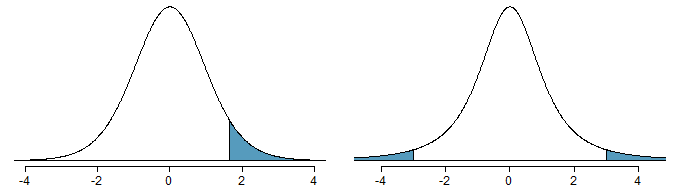
Figure 10.5: Left: The \(t\)-distribution with 20 degrees of freedom, with the area above 1.65 shaded. Right: The \(t\)-distribution with 2 degrees of freedom, with the area further than 3 units from 0 shaded.
As before, first identify the appropriate row: \(df=2\). Next, find the columns that capture 3; because \(2.92 < 3 < 4.30\), we use the second and third columns. Finally, we find bounds for the tail areas by looking at the two tail values: 0.05 and 0.10. We use the two tail values because we are looking for two (symmetric) tails.
10.4.3 Conditions for using the \(t\)-distribution for inference on a sample mean
To proceed with the \(t\)-distribution for inference about a single mean, we first check two conditions.
Independence of observations We verify this condition just as we did before. We collect a simple random sample from less than 10% of the population, or if the data are from an experiment or random process, we check to the best of our abilities that the observations were independent.
Observations come from a nearly normal distribution This second condition is difficult to verify with small data sets. We often (i) take a look at a plot of the data for obvious departures from the normal model, and (ii) consider whether any previous experiences alert us that the data may not be nearly normal.
When examining a sample mean and estimated standard error from a sample of \(n\) independent and nearly normal observations, we use a \(t\)-distribution with \(n-1\) degrees of freedom (\(df\)). For example, if the sample size was 19, then we would use the \(t\)-distribution with \(df=19-1=18\) degrees of freedom and proceed exactly as we did with the \(Z\)-distribution, except that now we use the \(t\)-distribution.
When to use the \(t\)-distribution
Use the \(t\)-distribution for inference of the sample mean when observations are independent and nearly normal. You may relax the nearly normal condition as the sample size increases. For example, the data distribution may be moderately skewed when the sample size is at least 30.}
10.4.4 One sample \(t\)-confidence intervals
Dolphins are at the top of the oceanic food chain, which causes dangerous substances such as mercury to concentrate in their organs and muscles. This is an important problem for both dolphins and other animals, like humans, who occasionally eat them. For instance, this is particularly relevant in Japan where school meals have included dolphin at times.
.CC BY 2.0 license](images/ch-inference-for-means/figures/rissosDolphin/rissosDolphin.jpg)
Figure 10.6: A Risso’s dolphin. Photo by Mike Baird www.bairdphotos.com.CC BY 2.0 license
Here we identify a confidence interval for the average mercury content in dolphin muscle using a sample of 19 Risso’s dolphins from the Taiji area in Japan.113 The data are summarized in Table 10.2. The minimum and maximum observed values can be used to evaluate whether or not there are obvious outliers or skew. Note that for the summary of mercury content in the muscle of 19 Risso’s dolphins from the Taiji area the measurements are in \(\mu\)g/wet g (micrograms of mercury per wet gram of muscle).
| Obs. | Mean | St. Dev. | Minimum | Maximum |
|---|---|---|---|---|
| 19 | 4.4 | 2.3 | 1.7 | 9.2 |
The observations are a simple random sample and consist of less than 10% of the population, therefore independence is reasonable. The summary statistics in Table 10.2 do not suggest any skew or outliers; all observations are within 2.5 standard deviations of the mean. Based on this evidence, the normality assumption seems reasonable.
In the normal model, we used \(z^{\star}\) and the standard error to determine the width of a confidence interval. We revise the confidence interval formula slightly when using the \(t\)-distribution: \[\begin{eqnarray*} \bar{x} \ \pm\ t^{\star}_{df}SE \end{eqnarray*}\]
The sample mean and estimated standard error are computed just as before (\(\bar{x} = 4.4\) and \(SE = s/\sqrt{n} = 0.528\)). The value \(t^{\star}_{df}\) is a cutoff we obtain based on the confidence level and the \(t\)-distribution with \(df\) degrees of freedom. Before determining this cutoff, we will first need the degrees of freedom.
In our current example, we should use the \(t\)-distribution with \(df=19-1=18\) degrees of freedom. Then identifying \(t_{18}^{\star}\) is similar to how we found \(z^{\star}\).
- For a 95% confidence interval, we want to find the cutoff \(t^{\star}_{18}\) such that 95% of the \(t\)-distribution is between -\(t^{\star}_{18}\) and \(t^{\star}_{18}\).
- We look in the \(t\)-table on in Table 10.1, find the column with area totalling 0.05 in the two tails (third column), and then the row with 18 degrees of freedom: \(t^{\star}_{18} = 2.10\).
Generally the value of \(t^{\star}_{df}\) is slightly larger than what we would get under the normal model with \(z^{\star}\).
Finally, we can substitute all our values into the confidence interval equation to create the 95% confidence interval for the average mercury content in muscles from Risso’s dolphins that pass through the Taiji area: \[\begin{eqnarray*} \bar{x} \ \pm\ t^{\star}_{18}SE \quad \to \quad 4.4 \ \pm\ 2.10 \times 0.528 \quad \to \quad (3.29, 5.51) \end{eqnarray*}\] We are 95% confident the average mercury content of muscles in Risso’s dolphins is between 3.29 and 5.51 \(\mu\)g/wet gram, which is considered extremely high.
Example 10.5 Estimate the standard error of \(\bar{x}=0.287\) ppm using the data summaries in Guided Practice 10.2. If we are to use the \(t\)-distribution to create a 90% confidence interval for the actual mean of the mercury content, identify the degrees of freedom we should use and also find \(t^{\star}_{df}\).
The standard error: \(SE = \frac{0.069}{\sqrt{15}} = 0.0178\). Degrees of freedom: \(df = n - 1 = 14\).
Looking in the column where two tails is 0.100 (for a 90% confidence interval) and row \(df=14\), we identify \(t^{\star}_{14} = 1.76\).10.4.5 One sample \(t\)-tests
Is the typical US runner getting faster or slower over time? We consider this question in the context of the Cherry Blossom Race, which is a 10-mile race in Washington, DC each spring.117
The average time for all runners who finished the Cherry Blossom Race in 2006 was 93.29 minutes (93 minutes and about 17 seconds). We want to determine using data from 100 participants in the 2012 Cherry Blossom Race whether runners in this race are getting faster or slower, versus the other possibility that there has been no change.
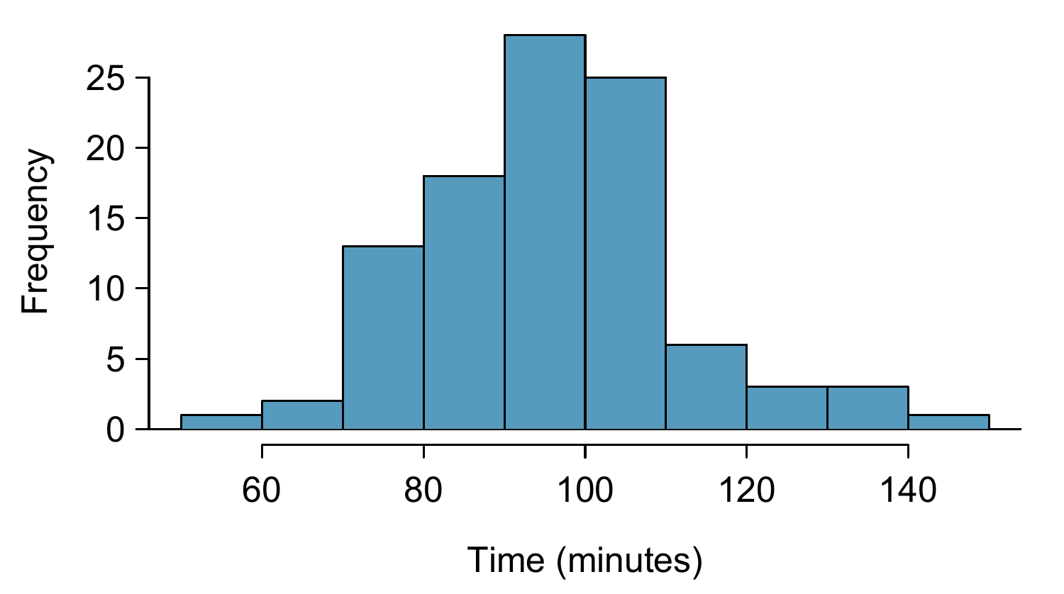
Figure 10.7: A histogram of time for the sample Cherry Blossom Race data.
With independence satisfied and slight skew not a concern for this large of a sample, we can proceed with performing a hypothesis test using the \(t\)-distribution.
To help us remember to use the \(t\)-distribution, we use a \(T\) to represent the test statistic, and we often call this a T-score. The Z-score and T-score are computed in the exact same way and are conceptually identical: each represents how many standard errors the observed value is from the null value.
Reference
Wasserstein, R. L., & Lazar, N. A. (2016). http://amstat.tandfonline.com/doi/abs/10.1080/00031305.2016.1154108
The ASA’s statement on p-values: context, process, and purpose. The American Statistician. Vol. 70, No. 2, pp. 129-133.
The standard deviation of the \(t\)-distribution is actually a little more than 1. However, it is useful to always think of the \(t\)-distribution as having a standard deviation of 1 in all of our applications.↩︎
We find the shaded area above -1.79 (we leave the picture to you). The small left tail is between 0.025 and 0.05, so the larger upper region must have an area between 0.95 and 0.975.↩︎
Taiji was featured in the movie The Cove, and it is a significant source of dolphin and whale meat in Japan. Thousands of dolphins pass through the Taiji area annually, and we will assume these 19 dolphins represent a simple random sample from those dolphins. Data reference: Endo T and Haraguchi K. 2009. High mercury levels in hair samples from residents of Taiji, a Japanese whaling town. Marine Pollution Bulletin 60(5):743-747.↩︎
(www.fda.gov/food/foodborneillnesscontaminants/metals/ucm115644.htm)[www.fda.gov/food/foodborneillnesscontaminants/metals/ucm115644.htm]↩︎
There are no obvious outliers; all observations are within 2 standard deviations of the mean. If there is skew, it is not evident. There are no red flags for the normal model based on this (limited) information, and we do not have reason to believe the mercury content is not nearly normal in this type of fish.↩︎
\(\bar{x} \ \pm\ t^{\star}_{14} SE \ \to\ 0.287 \ \pm\ 1.76\times 0.0178\ \to\ (0.256, 0.318)\). We are 90% confident that the average mercury content of croaker white fish (Pacific) is between 0.256 and 0.318 ppm.↩︎
(www.cherryblossom.org)[www.cherryblossom.org]↩︎
\(H_0\): The average 10 mile run time was the same for 2006 and 2012. \(\mu = 93.29\) minutes. \(H_A\): The average 10 mile run time for 2012 was than that of 2006. \(\mu \neq 93.29\) minutes.↩︎
With the conditions satisfied for the \(t\)-distribution, we can compute the standard error (\(SE = 15.78 / \sqrt{100} = 1.58\) and the T-score: \(T = \frac{95.61 - 93.29}{1.58} = 1.47\). (There is more on this after the guided practice, but a T-score and Z-score are calculated in the same way.) For \(df = 100 - 1 = 99\), we would find \(T = 1.47\) to fall between the first and second column, which means the p-value is between 0.10 and 0.20 (use \(df = 90\) and consider two tails since the test is two-sided). The p-value could also have been calculated more precisely with statistical software: 0.1447. Because the p-value is greater than 0.05, we do not reject the null hypothesis. That is, the data do not provide strong evidence that the average run time for the Cherry Blossom Run in 2012 is any different than the 2006 average.↩︎