Chapter 5 Scatterplots
When we have measurements on two dimensions for each observation – for example the height and dry weight of a plant – rather than plot a separate histogram for height and a separate histogram for weight it is generally more useful to plot both the height and weight information in a single figure. As the two measurements on each item generally have different units of measurement – e.g. weight in (g) or (kg) and height in (cm) or (in) – it is not possible to use a boxplot to represent the information. For such data the most effective visual representation is likely to be a scatter plot.
5.1 Creating a Basic Scatter Plot
In this example we will use the iris data set in base R. This is a famous data set that is associated with the work of R. Fisher (although he did not actually collect the data). The data set has four numerical variables related to Irises: petal length, petal width, sepal length, and sepal width; and one factor/grouping variable: species. To look at the data structure you can use str() and summary() as shown previously. An additional R command that allows you to look at the data structure is: head(), and this is the command used here. This command shows the first six rows of the data, including variable names, and is also a good way to make sure you understand the way your data has been read into R.
head(iris)  # prints the first few rows of the iris data set
#>   Sepal.Length Sepal.Width Petal.Length Petal.Width Species
#> 1          5.1         3.5          1.4         0.2  setosa
#> 2          4.9         3.0          1.4         0.2  setosa
#> 3          4.7         3.2          1.3         0.2  setosa
#> 4          4.6         3.1          1.5         0.2  setosa
#> 5          5.0         3.6          1.4         0.2  setosa
#> 6          5.4         3.9          1.7         0.4  setosa
We will use the generic plot() function to create a scatter plot of petal lengths by petal widths, and specify our formula the same way we did for boxplots: plot(y~x). R will automatically create a scatter plot because the command refers to two numerical variables. As in previous guides, let’s use the default R parameters first. For our initial plot we will ignore the grouping variable.
with(iris, plot(Petal.Length ~ Petal.Width))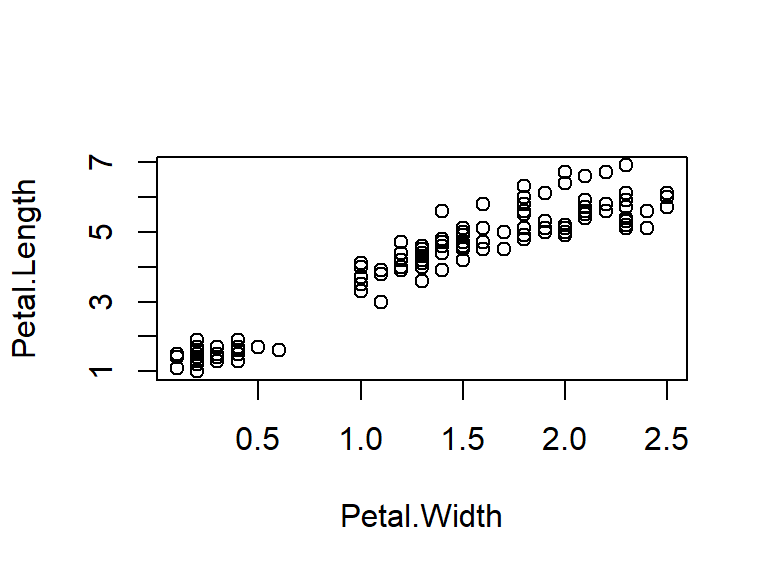
Figure 5.1: Illustration of a scatter box plot using the default parameter options in R.
5.2 Optional Parameters
From looking at the default plot, can you think of parameters you would want to change or add to improve your scatter plot? Let’s use the same parameters covered in previous guides, adding just one new thing in this section. We saw in the histograms guide how to change line type using lty; here we will use pch (Point CHange) to set the symbol to be used as our points. The default is 1, a circle, and options range from 0 to 25. To see all symbols available see Chapter 6, Graphical Parameters.
par(mfrow=c(1,1),mar=c(5,4,2,4))
with(iris,plot(Petal.Length ~ Petal.Width,
     col= "purple",                    # points colour
     pch= 5,                           # symbol 5 for rhombus/diamond
     main= "Petal Lengths and Widths", # figure title
     ylab= "Petal length (cm)",        # y-axis label
     xlab= "Petal width (cm)",         # x-axis label
     ylim= c(0,8),                     # y-axis range
     xlim= c(0,3),                     # x-axis range
     las= 1))                          # horizontal axis labels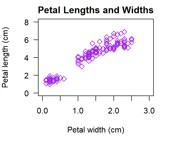
Figure 5.2: Illustration of a scatter plot with customised parameters in R.
Note: In many (most) applications it would not be necessary to have both a figure title and a caption label. In these guides both are used as it is necessary to describe both the figure and the R features that are covered in each example.
5.3 Scatter Plots with a Grouping Variable
From our scatter plot above we can see that petal length increases with petal width, but why is there a gap in the apparent linear relationship we see? Could this gap be explained by another variable in our data such as species? By differentiating the points by a third variable we can more clearly see what is going on in our data. Here we will differentiate points for each species by colour and in the next section we will make them different symbols and colours.
We don’t use any new parameters or functions to create our plot. We just define our col as the variable we would like points to be differentiated by. The colours that are used can be specified, but here we will let R automatically choose the first 1 to 3 colours since we have three species.
The last thing we will do is to add a legend. We did this in the last section of the histograms guide and here the legend is specified in almost the same format. We add only a single new parameter, bty. With bty we can specify the Box TYpe around the legend, or remove it altogether as we will do here. We first confirm the order of our species and then list them in this order for the parameter legend. In the legend col is set as 1:3 because in the plot we let R select colours for use, and R selected for first three colours. The colon here indicates the start and end points for our data range, where for ylim and xlim we are providing a list of the min and max.
par(mfrow=c(1,1),mar=c(5,4,2,4))
with(iris,plot(Petal.Length ~ Petal.Width,
     col= Species,    # colour points by variable 'Species'
     pch= 16,         # 16 = filled circle (easier to see differences)
     main= "Petal Lengths and Widths by Species",
     ylab= "Petal length (cm)",
     xlab= "Petal width (cm)",
     ylim= c(0,8),
     xlim= c(0,3),
     las= 1))

# check order of species to make sure we get the legend details correct
summary(iris$Species) # gives summary for only Species in iris data
#>     setosa versicolor  virginica
#>         50         50         50
# create legend
legend("bottomright",                         # put in bottom right corner
       title= "Species",                      # add a title
       legend= c("setosa","versicolor","virginica"), # specify species order
       col= 1:3,                              # add range of colours
       pch= 16,                               # use same symbol as in plot
       bty= "n")                              # remove legend box outline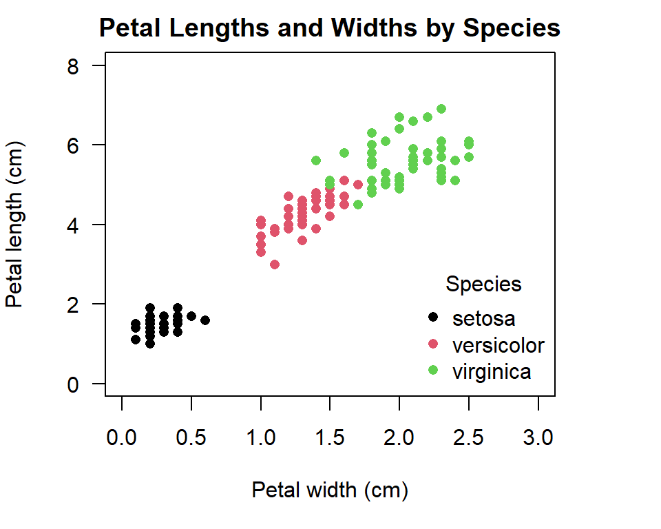
Figure 5.3: Illustration of a scatter plot with coloured grouping variable in R.
5.4 Advanced Scatter Plot Features
Now, what if you were submitting an academic paper that needed to be in black and white? Or, what if you were presenting your results and using colour could really help convey your message? For example, what if each of these species was a consistent different shade of purple and this trait explained why some iris species’ petals grow larger? Sometimes it is necessary to specify the colours used for groups, or to use specific symbols to show differentiation instead of colour.
When specifying col and pch in this way there are two things you must include: (i) the list of colours or symbols to use; and (ii) the variable in your data to apply this ‘list’ to, which must be specified as a numerical variable (this doesn’t mean it must be numbers). The format for col and pch will then look something like this:
c("col1","col2","col3")[as.numeric(group_variable)]
c(pt1,pt2,pt3)[as.numeric(group_variable)]
The only difference is that colour names must be enclosed in either single ‘quote marks’ or double “quote marks.” Notice how we have (parentheses) around the list of colours/symbols and [brackets] around the function defining which variable to apply the list to. Let’s try creating two plots using this new format. First we will create a plot where we specify the colours as different shades of purple:
par(mar=c(5,4,0,4))
#1. scatter plot with specified colours for grouping variable
with(iris,plot(Petal.Length ~ Petal.Width,
     # specify colours and tell R to apply them to the variable 'Species'
     col= c("darkorchid1","darkorchid","darkorchid4")[as.numeric(Species)],
     pch= 19))                                           # define symbol
# add legend
legend("topleft",
       title= "Species",
       legend= c("setosa","versicolor","virginica"),     # list species' order
       col= c("darkorchid1","darkorchid","darkorchid4"), # list colours
       pch= 19,                                          # define symbol
       bty="n")                                          # remove outline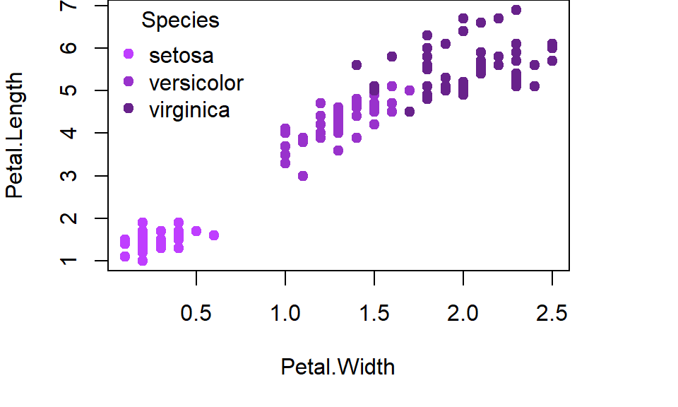
Figure 5.4: Illustration of a scatter plot with specified colours for grouping variable in R.
Now, let’s create a plot that defines shades of grey (good for black and while publications) as well as different symbols to represent species. For this plot, let’s also use other optional parameters we have learnt about:
par(mar=c(5,4,2,4))
#2. scatter plot with specified colours and symbols for grouping variable
with(iris,plot(Petal.Length ~ Petal.Width,
     # specify colours and tell R to apply them to the variable 'Species'
     col= c("grey10","grey50","grey80")[as.numeric(Species)],
     # specify symbols and tell R to apply them to the variable 'Species'
     pch= c(6,19,21)[as.numeric(Species)],
     main= "Petal Lengths and Widths",
     ylab= "Petal length (cm)",
     xlab= "Petal width (cm)",
     ylim= c(0,8),
     xlim= c(0,3),
     las= 1))
# add legend
legend("bottomright",
       title= "Species",
       legend= c("setosa","versicolor","virginica"),     # specify species' order
       col= c("grey10","grey50","grey80"),               # specify colours
       pch= c(6,19,21),                                  # specify symbols
       bty="n")                                          # remove outline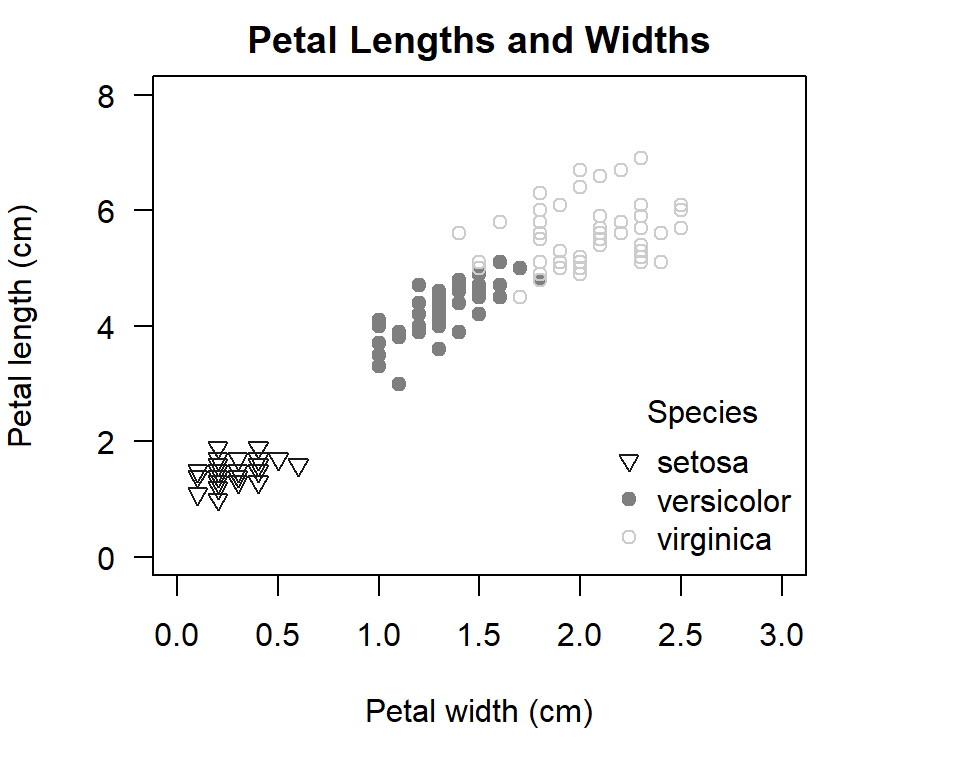
Figure 5.5: Illustration of a scatter plot with specified symbols and colours for grouping variable in R.
It is hard to think of a creating a plot with greater fine level control of the output!