Chapter 3 Histograms
The histogram is one of the most important plots used in Science. Histograms allow us to visualize the distribution of a data set. From a histogram it is relatively easy to see where most of the observations lie and get some idea about the variability of observations around the mean. Histograms also make it easy to see the maximum and minimum values in a data set; determine whether the distribution is symmetric or skewed in one direction or another; and detect outliers or unusual observations.
In a histogram the vertical axis indicates the frequency (or relative frequency) of the observations, and the horizontal axis describes the variable we are interested in. The key to creating a histogram is to group the observations into fixed intervals, and plot the number of observations in each interval. For example, consider the set: \[2, 13, 15, 23, 24, 25, 26, 29, 36, 37, 38, 42, 49.\] If we create intervals of: \[0-10, 10-20, 20-30, 30-40,\textrm{ and }40-50,\] the summary data we need to plot are:
| Intervals (bins) | 0-10 | 10-20 | 20-30 | 30-40 | 40-50 |
|---|---|---|---|---|---|
| Frequency | 1 | 2 | 5 | 3 | 2 |
There is no one fixed rule for creating histogram bin sizes, but R has a number of pre-programmed options that simplify the process. The default decision rule is based on the method of Sturges, but as you will see, there are others. These short cuts are not available in generic spreadsheet software such as MS Excel.
3.1 Creating a Basic Histogram
First, we need some data. Let’s use the PlantGrowth data set in the base R package datasets. Normally we will need to load a data set into R, but here we are using one of the in-built sample data sets. To look at the data structure we use the function str(). When you apply this function the output says that there are 30 observations and two variables. One of the variables is a continuous variable: weight; the other variable is a categorical variable: treatment. The categorical variable has three levels. When using R the first step is to always check the data structure to see what has been read in.
Our next step is to create a visual representation of the data. Specifically, we want to create a histogram. For our initial plot we will be ignoring the treatment variable for the moment and just create a histogram of plant weights. The easiest way to create a histogram is to use the default R parameter settings. Creating a basic histogram is easy. You just tell R the name of the data set you are working with – PlantGrowth – which you do via the with() command; and then you specify the name of the column of data you want to apply the hist() function to, which in this instance is the weight column.
par(mar = c(3, 3, 3, 3))
str(PlantGrowth)  # function to look at the data 'structure'
#> 'data.frame':    30 obs. of  2 variables:
#>  $ weight: num  4.17 5.58 5.18 6.11 4.5 4.61 5.17 4.53 5.33 5.14 ...
#>  $ group : Factor w/ 3 levels "ctrl","trt1",..: 1 1 1 1 1 1 1 1 1 1 ...
with(PlantGrowth, hist(weight))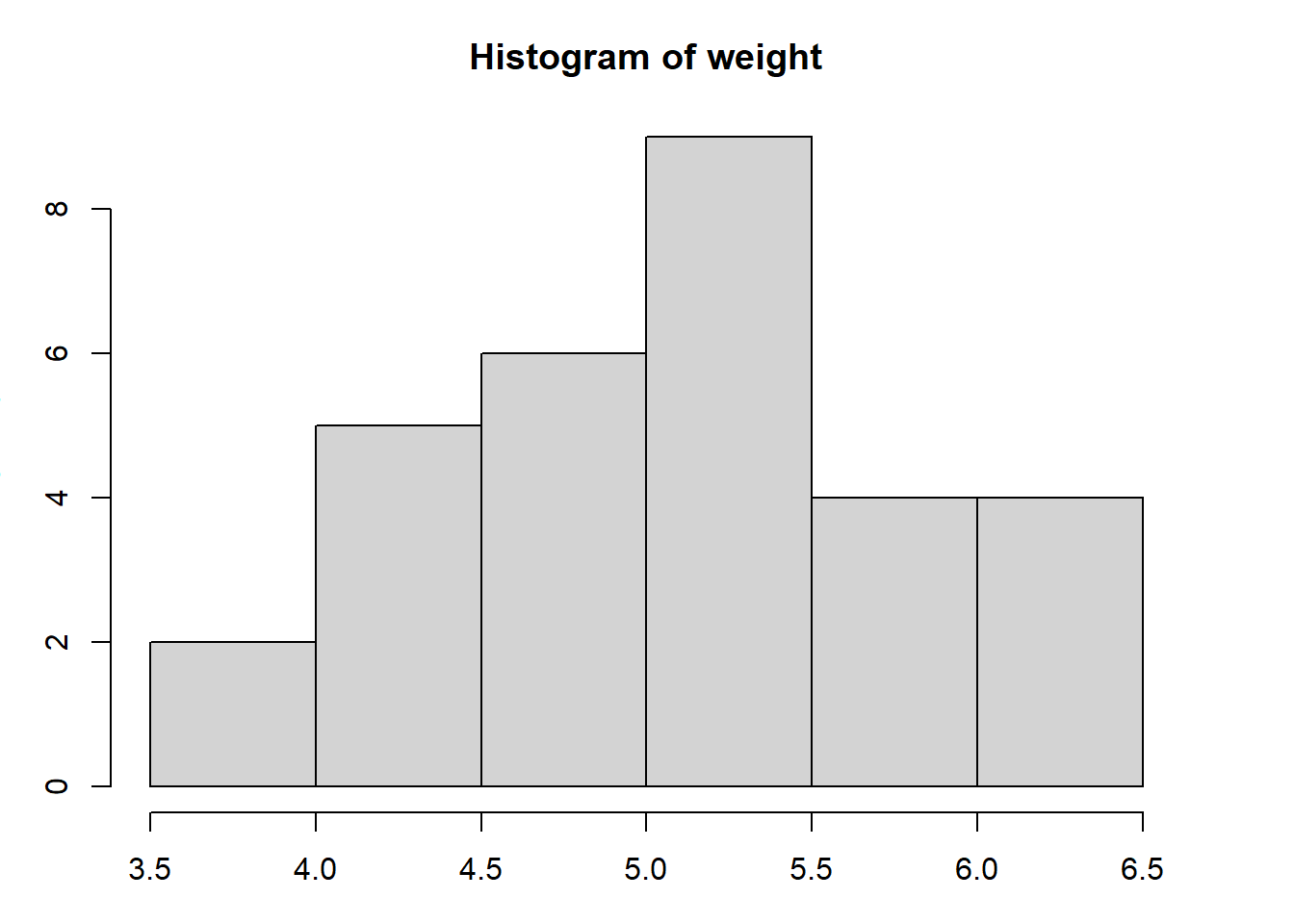
Figure 3.1: Illustration of a basic histogram using the default parameter options in R.
# read as: apply the hist() function to the weight column of the Plant growth
# data set
Note that throughout this book, code blocks do not show the R command-line prompt >, and console outputs are denoted with a double ##. This allows you to easily copy-paste the commands to see the figures and outputs in your own R software application, and create your own reference scripts. You are encouraged to start the learning process with this copy and paste approach.
3.2 Optional Parameters
Now, let’s explore some of the optional parameters of the function hist() and compare the two plots. We will use xlim and ylim to specify the axes ranges, col and border to set the column fill colour and the border colour for the bins, and main, xlab and ylab to label the histogram and axes. Within the code, function parameters are separated by commas and contained within the (parentheses) following the function name. Notice how specifying these parameters can allow you to create a publication quality figure that best illustrates your data.
par(mfrow=c(1,2),mar=c(5,4,4,4))
with(PlantGrowth,hist(weight))
with(PlantGrowth,hist(weight,
      xlim= c(3,7),                       # set the x-axis range
      ylim= c(0,10),                      # set the y-axis range
      col= "lightgrey",                   # fill the columns
      border= "black",                    # column border
      main= "Histogram of Plant Weights", # figure title
      xlab= "Dried weight (g)",           # x-axis label
      ylab= "Frequency"))                 # y-axis label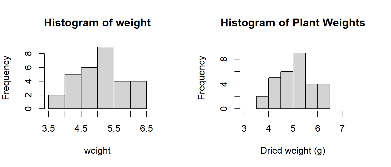
Figure 3.2: Comparison of a histogram with the default settings and one customised by setting the function parameters.
3.3 Changing Bin Sizes
In addition to specifying the axes values, we can also set the bin sizes in a histogram using the optional parameter breaks. Breaks can be specified using algorithms included in the function, the default is Sturges, or by creating custom bins where you set the sequence with seq().
For this example we will simulate (make up) our data so we have a greater number of observations drawn from a wider range of values. We will use two new functions to create a data frame data.frame() that holds our data. A data.frame is the term used for any data set we will use to hold our data in R. The simulated data will be data that matches a normal distribution rnorm(). To set the number of observation in the data frame we use n; and we set the mean and the standard deviation with (mean, sd). Data simulation is a neat trick to know about. Welcome to the data simulation club!
We will then use the function names() to change our simulated variable’s name. Notice that with this function we use [brackets] to specify the column number to change, rather than (parentheses) which are used to enclose parameters of a function,
e.g. names(simulated_data). This may be confusing at first, but over time it becomes more clear.
Try executing str(simulated_data) before and after the names() function is used to better understand what it is doing. It is important to always have variable names which are long enough to easily understand, but short enough to keep your code clean and reduce unnecessary typing. Also, avoid using spaces in variable names as R is not able to easily recognize the words together. This is why we have used an underscore, _, between var and name to make var_name below.
# 1. Simulate Data:

set.seed(1234)  # allow data to be reproducible (you will get exactly the same!)
# we want 1000 obs, a mean of 500 and sd of 50
simulated_data <- data.frame(rnorm(n = 1000, mean = 500, sd = 50))
# assign variable name [column #1] as 'var_name'
names(simulated_data) <- c("var_name")
So, now we are actually at the normal starting point of analysis. Whenever we have a data frame in R the first thing we do is apply a function like the str() function to check the structure of the data object.
str(simulated_data)
#> 'data.frame':    1000 obs. of  1 variable:
#>  $ var_name: num  440 514 554 383 521 ...
Can you match the data structure reported back by R?
Now let’s look at a series of histograms where we use different decision rules to decide the bin widths. There is no wrong or right way to decide on the bin widths. The default option is always OK, but sometimes you can improve on the default R settings. You really just need to use a trial and error approach.
par(mfrow = c(2, 2), mar = c(5, 4, 4, 4))

with(simulated_data, hist(var_name, breaks = "Sturges", main = "Default bins"))
with(simulated_data, hist(var_name, breaks = "Scott", main = "Scott bins"))
with(simulated_data, hist(var_name, breaks = "FD", main = "FD bins"))
with(simulated_data, hist(var_name, breaks = (seq(from = 100, to = 700,
    by = 10)), main = "Custom bins"))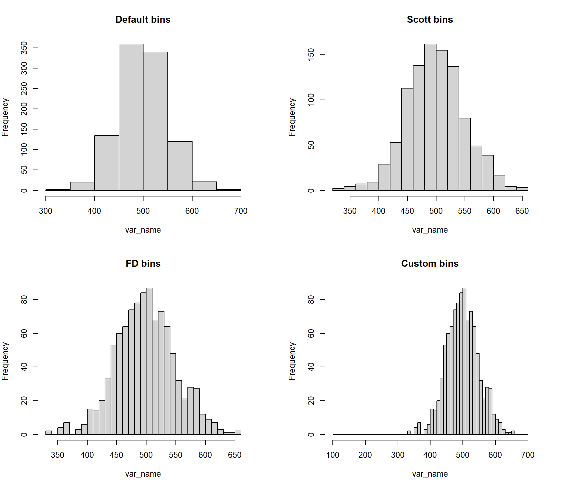
Figure 3.3: Example of histogram break options in R (Scott, FD and Sturges - default) and customised breaks.
Note the colour-coding in the code examples here - it can really help to understand how R works. Red depicts a function, green a parameter, blue and pink show your input for character and numerical parameters, and black signifies your data (data set and variable name).
3.4 Advanced Histogram Features
This subsection covers how you would add extra information to your histogram using more complicated coding. These features are only relevant for students in the latter part of their degree and are not needed for students in an introductory statistics course.
The below code may seem confusing at first, but it is actually easier than attempting to manually format a histogram (or any figure) in MS Excel to publication standard. We will use the same PlantGrowth data as in the earlier examples, but we will also add a vertical line for the mean and two vertical lines to indicate one standard deviation on each side of the mean using the function abline(). Additionally, we will also include a basic legend showing what these lines signify with legend(), and tweak the axes formats slightly.
The parameters used in these functions are as follows:
lty= Line TYpe (a number relating to a line type, e.g. solid or dashed)lwd= Line WiDth (larger number indicates thicker line)col= COLour of line (can be a name or number relating to a colour)xaxs = iforces the x-axis to fit the `internal’ data range (3 to 8)yaxs = iforces the y-axis to fit the `internal’ data range (0 to 10)v= variable name specifying the values on the x-axis for vertical lines. To create horizontal lines you would usehand specify the y-axis variable (only for abline)legend= a vector, specified using functionc(), short for concatenate, of the names of the items to include in the legend (only for legend)topright= this specifies the location of the legend and can also be written as x,y coordinates.
Before we create out plot let’s find the mean and standard deviation and save them as `objects’.
# calculate the mean & SD and save them as objects so they can be called upon
# when creating our vertical lines
mean.weight <- with(PlantGrowth, mean(weight))
sd.weight <- with(PlantGrowth, sd(weight))
mean.weight
#> [1] 5.07
sd.weight  # see how the mean and sd have now been stored?
#> [1] 0.701
Now let’s create the custom histogram. Note that because the x-axis range does not extend to zero some people would argue that the R defaults are preferable to the format shown here. It is an open question.
par(mar=c(5,4,4,4))
# plot our histogram
with(PlantGrowth, hist(weight,xlim = c(3,8),ylim = c(0,10), xaxs= "i", yaxs="i"))
# add vertical lines for the mean and 1 sd above and below the mean
abline(v= mean.weight, lty=1, lwd=3,col="blue")
abline(v= mean.weight - (sd.weight), lty=2, lwd=1, col="red")
abline(v= mean.weight + (sd.weight), lty=2, lwd=1, col="red")
# add our legend
legend("topright",             # specify location
       legend=c("Mean", "Mean +/- SD"), # specify contents of legend
       col=c("blue","red"),    # specify colours in order of legend contents
       lwd=c(3,1),             # specify line widths in order
       lty=c(1,2))             # specify line types in order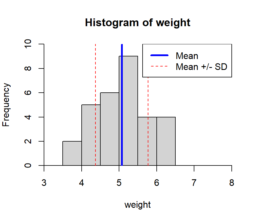
Figure 3.4: Histogram displaying measures of central tendency.