Chapter 4 Boxplots
Histograms are most effective when you want to describe a single distribution. When you want to compare groups a boxplot is more effective. A boxplot is a visual representation of the five number summary of a data set. The five number summary of a distribution is an alternative to using the mean and standard deviation to describe the distribution. Recall that the five number summary consists of: the maximum and minimum values, the interquartile range (IQR), and the median.
In a boxplot the box shows the IQR, and the whiskers show the maximum and minimum values. A horizontal line is used to indicate the median. Sometimes drawing the whiskers all the way to the maximum or minimum values distorts the visual representation of the data. As such, a limiting rule for how far the whiskers should extend past the box is also applied. The default decision rule in most software programs is to extend the whiskers no more than 1.5 times the IQR. When a value extends past this point, rather than extending the whisker to that value it is typically identified with a dot or other symbol. Sometimes these observations are referred to as `outliers’.
4.1 Creating a Basic Boxplot
This example uses the PlantGrowth data set in base R. The PlantGrowth data set has two variables and the data set is organised in what is called long-format or stacked-format. Long-format data means one column contains numerical values weight and one column lists the context of the value group. We say, weight is a continuous/numerical variable and group is a factor/categorical variable. The alternative to long-format data is wide-format data. Wide-format data has the measurement values listed in separate columns for each group of the factor variable. In Science it is common to see data organised in long-format. In the Social Sciences it is common to see data organised in wide-format.
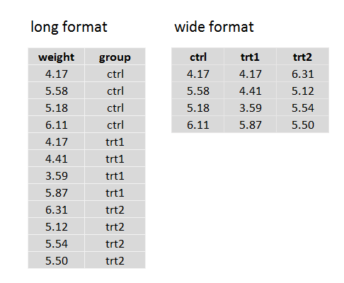
Figure 4.1: Long and wide format data
Let’s create a boxplot to show the weight distributions of the three plant groups: ctrl, trt1, and trt2. To create a boxplot we use a formula that takes the general form: boxplot(y~x). In the formula y is the numerical (weight) variable and x the factor (group) variable. We apply the command to the data PlantGrowth using the function with(). For our initial plot we use the default boxplot parameters in R. In subsequent sections we explore how to customize boxplots.
Remember, before creating any plots you must first look at the data to make sure it has been read in correctly and there are no obvious errors. Here we use str() to look at the structure of the data, and then summary() to obtain ‘summary’ information on the data values. The str() function tells us we have two columns of data: the numerical values and a column with the names that identify the grouping. The summary() function provides a five number summary of the weights data (ignoring the grouping structure), plus the mean; and also lists the different ‘levels’ of our factor variable (ctrl, trt1, trt2). The output also shows how many observations we have for each level; which in this case is ten observations for each level.
str(PlantGrowth)  # we have 30 observations, 2 variables
#> 'data.frame':    30 obs. of  2 variables:
#>  $ weight: num  4.17 5.58 5.18 6.11 4.5 4.61 5.17 4.53 5.33 5.14 ...
#>  $ group : Factor w/ 3 levels "ctrl","trt1",..: 1 1 1 1 1 1 1 1 1 1 ...
summary(PlantGrowth)  # a summary for each variable in PlantGrowth
#>      weight      group
#>  Min.   :3.59   ctrl:10
#>  1st Qu.:4.55   trt1:10
#>  Median :5.16   trt2:10
#>  Mean   :5.07
#>  3rd Qu.:5.53
#>  Max.   :6.31
Once we have a clear understanding of the data structure we can then create our boxplot.
par(mar = c(3, 3, 0, 3))  # (B,L,T,R)
# now create your box plot
with(PlantGrowth, boxplot(weight ~ group))  # long data, use ~ not ,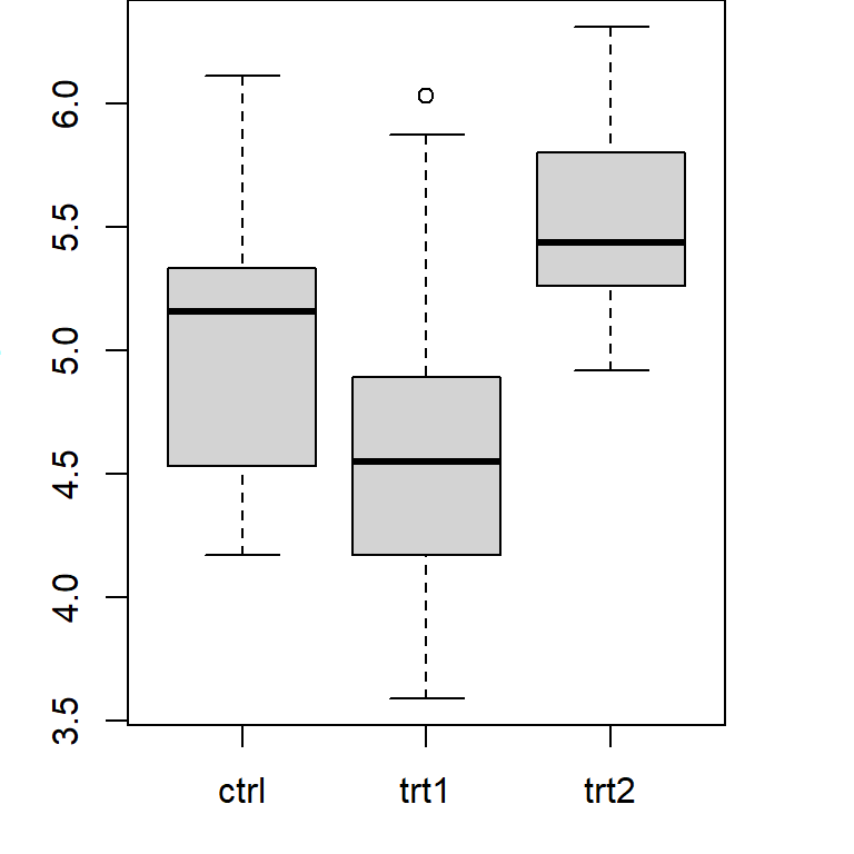
Figure 4.2: Illustration of a basic box plot using the default parameter options in R.
Now look at the boxplot. With a simple visualisation we can already see several important things. First, the dispersion of measurements for treatment 2 looks to be smaller than for treatment 1 and the control. Second, the observations for treatment 2 are, on average, a little higher than for the control and treatment 1. We have not conducted any formal statistical tests, and these differences could be due to sampling variation only, but the visual plot provides us with important information about the data we are working with.
4.2 Optional Parameters
Now let’s modify our boxplot to get something that is of publication standard, something that is almost impossible with MS Excel. All but one of the parameters we use here – boxwex, which is used for changing the width of your boxes – were covered in the histogram example. If you are feeling lost with the material you can refer back to the histogram example.
par(mfrow=c(1,1),mar=c(5,4,2,4))
with(PlantGrowth,boxplot(weight ~ group,
     col= "gray",                        # box colour (US and UK spelling both work)
     border= "black",                    # box border
     main= "Box Plot of Plant Weights",  # figure title
     xlab= "Treatment",                  # x-axis label
     ylab= "Dried weight (g)",           # y-axis label
     ylim= c(3,7),                       # y-axis range
     boxwex= 0.6))                       # set box widths (60% of default)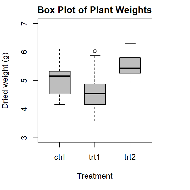
Figure 4.3: Illustration of a box plot with customised parameters in R.
The boxes are now narrower; we have clean axis labels that are informative; and the shading for the boxes looks like something we would see in a science journal.
4.3 Horizontal Box Plots
There are several reasons you may want a horizontal boxplot. One reason is to draw more attention to the continuous variable’s values by placing them on the horizontal axis. Also, when you only have one group, a horizontal boxplot looks better than a vertical boxplot. In R it is simple to create a horizontal boxplot; you use the same command as before, but set the parameter horizontal as TRUE.
par(mar=c(5,4,2,4))
with(PlantGrowth,boxplot(weight ~ group,
     col= "gray",
     main= "Horizontal Box Plot",
     xlab= "Dried weight (g)",
     ylab= "Treatment",
     horizontal = TRUE))  # set horizontal to TRUE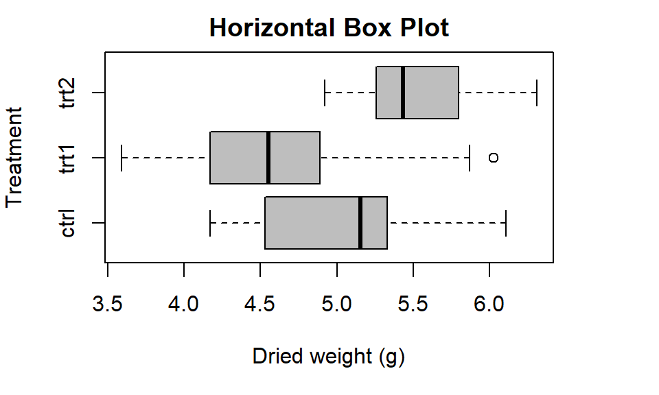
Figure 4.4: Illustration of a horizontal box plot in R.
4.4 Advanced Boxplot Features
Now let’s explore how we can change: the fill colour and outlier format; group names and the order of our groups (factor levels); and set the orientation of the axis labels so they read horizontally. This material is advanced and may not be relevant to all students.
The default group order in R is for the groups to be ordered alphabetically. However, we might prefer to have the treatments listed first and the control group last. As ‘c’ in ‘ctrl’ comes before ‘t’ in ‘trt’ we will need to tell R the order we want using the function factor().
We might also want to use full names and spaces in the labels to more clearly illustrate their meanings. Let’s rename the levels of our factor variable as ‘Treatment 1,’ ‘Treatment 2,’ and ‘Control.’ Since we still want the abbreviations to be used in our actual data we will change the names only in the plot, using the boxplot() parameter names, not the raw data set. We will also provide a list of colours to better contrast the control group with the treatment groups and change the orientation of the y-axis values (weights) so they are horizontal. As a final step we will also change the symbol and colour used to identify the outlier observation in treatment 1 group.
The following steps will be followed to produce our new boxplot:
- Change the order of factor levels with
factor(), by listing them in parameterlevels. - Create your boxplot as before, but setting the following parameters:
- use
namesto list the labels for each box using the new order of groups - use
colto list the colours to fill the boxes with - set
lasto 1 to change your y-axis values to horizontal (0=parallel to axis (default), 1=horizontal, 2=perpendicular to axis, 3=vertical) - use
outpchto change the change the outlier symbol (20= solid dot), andoutcolto tell R what colour to use for the symbol
Note: to see a list of the colours available in R, type the following command into your console: colours(distinct = FALSE), and see also Chapter 6, Graphical Parameters.
par(mfrow=c(1,1),mar=c(3,4,2,4))
#1: Reorder x-axis factor levels
# Note: data$variable is used to specify your data here, instead of with()
PlantGrowth$group<-factor(PlantGrowth$group, levels= c("trt1", "trt2", "ctrl"))
# check the order has changed
summary(PlantGrowth$group)
#> trt1 trt2 ctrl
#>   10   10   10
#2. create a plot
with(PlantGrowth,boxplot(weight ~ group,
     col= c("grey70","grey70","grey40"),      # list colours to fill boxes
     names= c("Treatment 1", "Treatment 2","Control"), # list box names
     main= "Publication quality example",
     ylab= "Dried weight (g)",
     outpch=20,                           # change outlier symbol
     outcol="grey70",                     # change outlier colour
     ylim= c(3,7),                        # y-axis range
     boxwex= 0.6,                         # make the box width thinner
las= 1)) # set axis values to horizontal 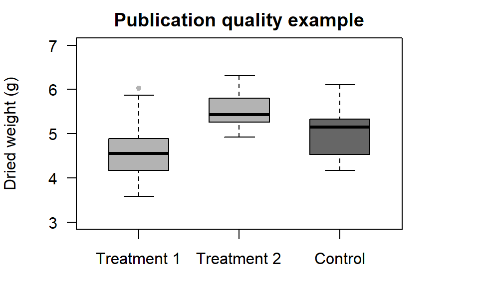
Figure 4.5: Illustration of a box plot with customised axes in R.