Chapter 19 Regression with Transformations
Once we add the log transformation as a possibility – for either the x-variable, the y-variable, or both – we can describe many possible data trends. The only issue is that we need to make sure we know how to interpret the slope estimate in our model after the transformation. The four possible scenarios are described below.
Model 1. linear-linear model:
\[ Y_i = \alpha + \beta X_i + e_i \]How to interpret the slope for model 1: We say a one unit change in X, on average, leads to a \(\beta\) unit change in Y.
Model 2. linear-log model:
\[ Y_i = \alpha + \beta logX_i + e_i \]How to interpret the slope for model 2: We say a one percent change in X, on average, leads to a \(\beta \div\) 100 unit change in Y.
Model 3. log-linear model:
\[ logY_i = \alpha + \beta X_i + e_i \]
How to interpret the slope for model 3: We say a one unit change in X, on average, leads to a \(\beta \times\) 100 percent change in Y.Model 4. log-linear model:
\[ logY_i = \alpha + \beta logX_i + e_i \]
How to interpret the slope for model 4: We say a one percent change in X, on average, leads to a \(\beta\) percent change in Y.
19.1 Log Transformations
For this example we are interested in modelling the relationship between a biodiversity index measure and altitude. Specifically, we are interested in understanding if biodiversity varies with altitude.
Our \(\texttt{y}\) or dependent/response variable is the diversity index measure, and our \(\texttt{x}\) or independent/explanatory variable is altitude above sea level. When creating linear regression models and working with scatterplots we give R the formula: \(\texttt{y}\sim\texttt{x}\). Deciding which variable goes on the y-axis and which variable goes on the x-axis is tricky. The convention is to use the variable that we think is doing the explaining on the horizontal (x-axis). Because we think that altitude above sea level might `explain’ the observed level of biodiversity, we place altitude on the horizontal axis and biodiversity on the vertical.
Let’s read in the data and have a look at what we have. Recall that normally you would have the data in an Excel file. Here I type the data in so there is a complete record of the values used.
# read in our data
diversity.data<- data.frame(
  altitude= c(56, 57.4 , 59.3, 60.6, 61.1, 62.6, 69.5, 80.6,
              93, 104.3, 109.4, 120.3, 132.9, 138.3 ),
  d.index= c(0.1846, 0.2760, 0.4635, 0.0898, 0.1082, 0.2593, 0.06408, 0.0419,
             0.0670, 0.0405, 0.0320, 0.0174, 0.0156, 0.0399 ))

# Use both str, summary to look at data
str(diversity.data)
#> 'data.frame':    14 obs. of  2 variables:
#>  $ altitude: num  56 57.4 59.3 60.6 61.1 ...
#>  $ d.index : num  0.1846 0.276 0.4635 0.0898 0.1082 ...
summary(diversity.data)
#>     altitude        d.index
#>  Min.   : 56.0   Min.   :0.016
#>  1st Qu.: 60.7   1st Qu.:0.040
#>  Median : 75.0   Median :0.066
#>  Mean   : 86.1   Mean   :0.121
#>  3rd Qu.:108.1   3rd Qu.:0.166
#>  Max.   :138.3   Max.   :0.464
As we have two continuous variables, rather than a boxplot we create a scatter plot. Note the form of the scatter plot formula is \(\texttt{y}\sim\texttt{x}\) so we have d.index~altitude in the plot formula. Also note that in your own plots you will just have the figure caption, not a figure caption and a figure title.
with(diversity.data, plot(d.index~altitude, # create our scatter plot
     pch= 4,
     main= "Biodiversity and altitude relationship",
     ylab= "Biodiversity (Index)",
     xlab= "Height above sea level (m)",
     ylim= c(0,0.5), xlim= c(20,150), las= 1))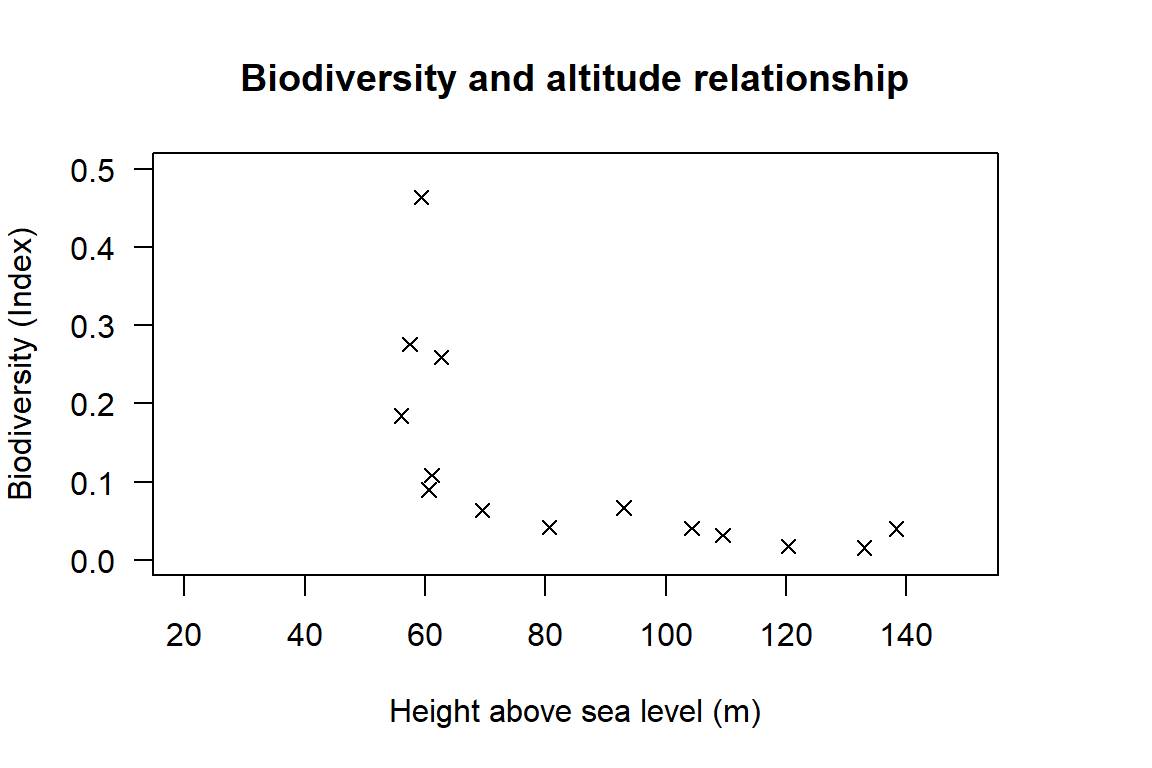
Figure 19.1: Scatter plot showing the relationship between biodiversity and height above sea level.
The plot looks quite different from the previous lobster example. The plot shows a clear non-linear relationship. Let’s create three scatter plots showing the possible log transformations of our data (log-linear, linear-log and log-log), and our original plot (linear-linear) to see if any of these transformation generate an approximately linear relationship.
To get the log of a value or set of values we use the function log(). We will also use a new function which allows us to set different graphical parameters for our figures, par(). We will use par() to set the number of plots per plotting window using parameter mfrow. Here we would like 2 rows \(\times\) 2 columns so we can see all 4 plots together to more easily compare them. i.e. we are creating a grid to display each individual plot at the same time.
# set the number of plots (row, column) per window
par(mfrow= c(2,2)) # 2 rows and 2 columns = four plots

# plot 4 scatter plots
with(diversity.data, plot(d.index~altitude,
    main= "Raw Data: linear - linear")) # untransformed
with(diversity.data, plot(log(d.index)~altitude,
    main= "Transformed: log - linear")) # log(y)
with(diversity.data, plot(d.index~log(altitude),
    main= "Transformed: linear - log")) # log(x)
with(diversity.data, plot(log(d.index)~log(altitude),
    main= "Transformed: log - log"))    # log(x) & (y)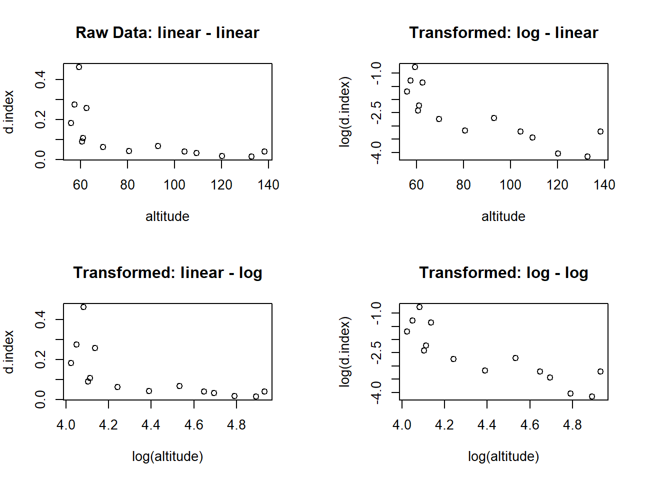
Figure 19.2: Scatter plots showing the relationship between biodiversity and altitude using untransformed data and three different log transformations.
Which, if any, of the transformations achieved an approximately linear relationship? It is not 100 percent clear, but i am going to say that the log-log model seems to be the best fit across the available options. Let’s create a linear trend line for the data using the log-log model and add the trend line to a scatter plot on the log-log scale.
# create our model Note the way we tell R the data file name
lm.Diversity <- lm(log(d.index) ~ log(altitude), data = diversity.data)

# print the intercept and slope coefficients
coef(lm.Diversity)
#>   (Intercept) log(altitude)
#>          9.16         -2.67
From the output have the intercept estimate of 9.157 and the slope estimate -2.672. As we have fitted a log-log model, the equation tells us that for every 1 percent increase in altitude, biodiversity decreases, on average, by 2.67 percent. When we have a regression equation we always add the comment, on average. The intercept does not have an intuitive meaning in this model, so we restrict our focus to the slope.
Note: You have MUCH less confidence using a model to extrapolate beyond the range of your data. Formally we only know what is happening for the data range we observe. So, this model may be useful for predicting biodiversity only for altitudes between 56m and 138m above sea level. Outside this range the model has little to say, and it would be dangerous to extrapolate to other altitudes.
The last step is to graphically display our model. We can do this by adding a trend line to our scatter plot with the abline() function and identifying our line in a legend with the legend() function. Note we can add the line either by specifying the numerical values directly ( = intercept and = slope), or by telling R to get the slope and intercept from our regression model (lm.diversity).
#  Base plot
with(diversity.data, plot(log(d.index)~log(altitude),
     pch= 4,
     ylab= "Biodiversity Index (log scale)",
     xlab= "Height above sea level (log scale)",
     las= 1 ))

# add our trend line
abline(lm.Diversity, lty= 2, lwd= 2, col= "blue")

# add a pretty fancy legend
legend("topright", legend=c("Trend line","Observation"), lty=c(2,NA),
       pch =c(NA,4),lwd=c(2,NA), col =c("blue","black"), bty="n")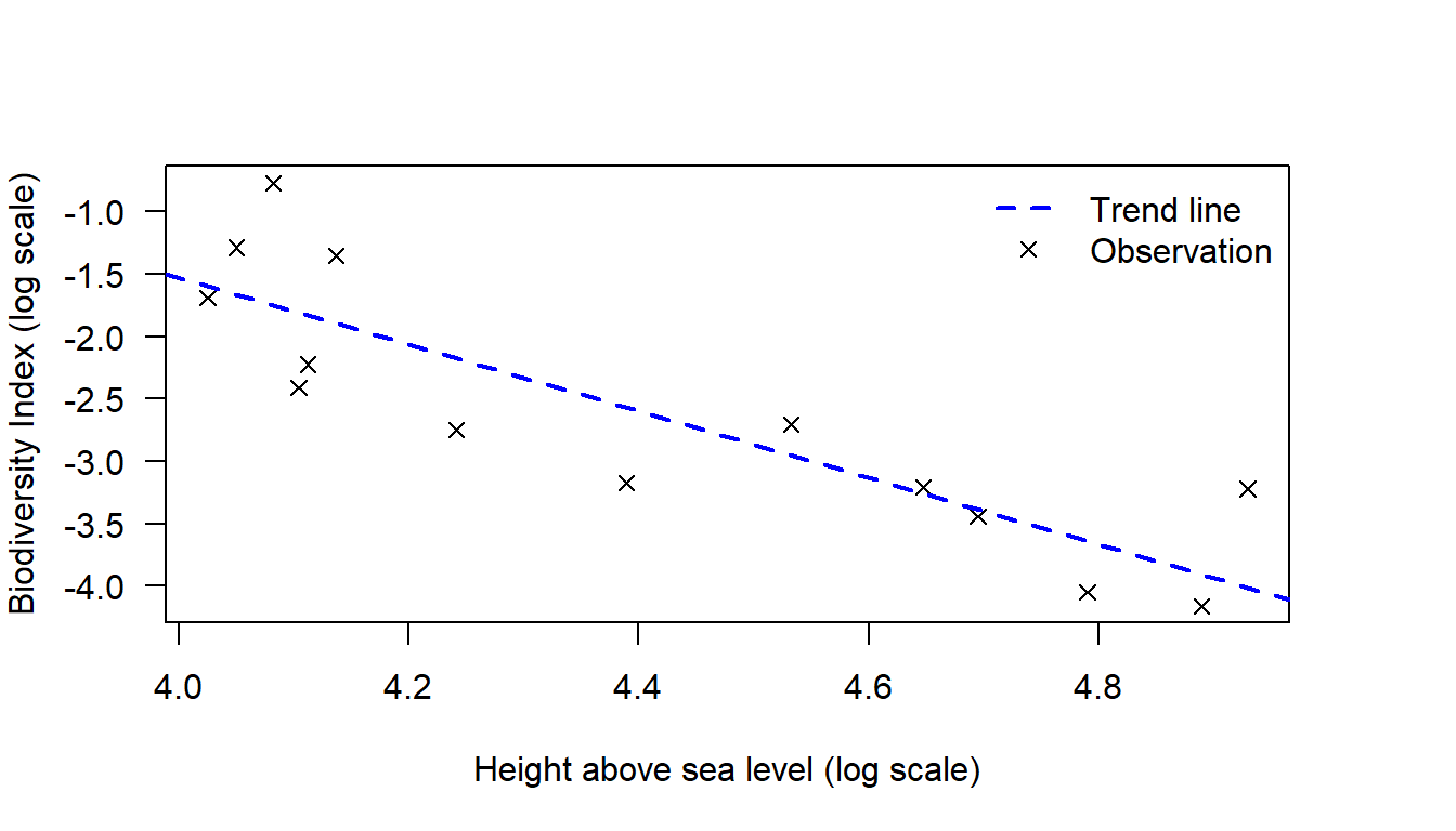
Figure 19.3: Relationship between biodiversity and altitude (log-log scale).
19.2 Statistical Significance of the Slope Estimate
The decision rule we use to generate an estimate of the slope and intercept (the least squares estimator) will always generate estimates of the slope and intercept. However, we are interested in knowing whether or not the slope estimate we obtain is statistically different from zero. The question we are asking is could the pattern we observe in the data be due to chance, or is it a real trend?
To determine whether or not the slope estimate is statistically different from zero we conduct a t-test. The t-test for the slope (and intercept) works just the same way as our earlier t-tests, and we will use the same decision rule. Specifically, if the t-test p-value is less than 0.05 we will reject the null hypothesis that the slope estimate is equal to zero. In practice this decision rule means that we have set the test alpha level at 0.05. With regression models it is often the case that people use multiple standards for testing rather than just 0.05. This added feature is usually captured with an additional footnote in the summary table.
To conduct the t-test we use the summary() function. The summary() function will conduct a t-test on both the slope and the intercept, and will also report some additional information on our linear model. This automated routine is one of the very useful things about R. While MS Excel will fit a trend line, the default output does not tell you whether or not the estimates are statistically different from zero. Let’s run a formal test on the model we created previously, and saved as: lm.Diversity.
Step 1: Set the Null and Alternate Hypotheses
Here we will be testing only the slope as we are not interested in the intercept.
- Null hypothesis: The slope is equal to zero
- Alternate hypothesis: The slope is not equal to zero
- Null hypothesis: The slope is equal to zero
Step 2: Print the test output
We obtain all the output with a simple command
summary(lm.Diversity). The output we get has many elements but we will work through the detail in stages.summary(lm.Diversity) #> #> Call: #> lm(formula = log(d.index) ~ log(altitude), data = diversity.data) #> #> Residuals: #> Min 1Q Median 3Q Max #> -0.6031 -0.4076 -0.0747 0.3435 0.9806 #> #> Coefficients: #> Estimate Std. Error t value Pr(>|t|) #> (Intercept) 9.157 1.982 4.62 0.00059 *** #> log(altitude) -2.672 0.449 -5.95 6.7e-05 *** #> --- #> Signif. codes: 0 '***' 0.001 '**' 0.01 '*' 0.05 '.' 0.1 ' ' 1 #> #> Residual standard error: 0.544 on 12 degrees of freedom #> Multiple R-squared: 0.747, Adjusted R-squared: 0.726 #> F-statistic: 35.4 on 1 and 12 DF, p-value: 6.71e-05Step 3: Interpret the Results
The output here is quite a bit more complex than for basic t-tests. Let’s focus, for now, on the “Coefficients” section of the output. This section of the output provides the estimates for our trend line and the results for the test of statistical significance. Under the “Estimate” column we see the same values as we obtained when using the
coef()function - the intercept and slope terms (distance is the slope estimate).The next column is the “Std. Error” column and the values in this column are the standard error for each coefficient. The standard error in a regression model has the same interpretation as the standard error of the mean in our earlier t-test examples. These values can be thought of as a measure of uncertainty for our slope and intercept intercept values.
Next, we can see t-values. The t-values have been calculated using the standard approach. Specifically, these values have been calculated as: Estimate value minus the null hypothesis test value divided by the standard error. In this instance our null hypothesis test value is zero, so the t-value is calculated as: \((-2.671 - 0 / 0.449) = -5.95\). Lastly we can see the p-values. The p-values are what we use to make a decision about whether or not the slope estimate is statistically different from zero. Since the p-value for the slope is: \((<0.001)\), which is smaller than \(0.05\), we:
Reject the null hypothesis that the slope is equal to zero.
Why do we care if the slope estimate is different to zero? Well, if the slope is zero this means that there is no real trend in the data. The variation we have observed is just due to sampling variation. Fundamentally, we are interested in knowing whether the trend line we fit to the data represents a real trend line or not. We want to know whether or not there really is a relationship between altitude and diversity.
19.3 Measure of Model Fit
The final thing we are interested in is the \(R^2\) value. This value has an interpretation as the proportion of the variation in the data explained by the model. In R, the \(R^2\) value is reported as the \(\texttt{Multiple R-squared value}\), which is the second last line of the summary output. See if you can find it in the output below.
summary(lm.Diversity)
#>
#> Call:
#> lm(formula = log(d.index) ~ log(altitude), data = diversity.data)
#>
#> Residuals:
#>     Min      1Q  Median      3Q     Max
#> -0.6031 -0.4076 -0.0747  0.3435  0.9806
#>
#> Coefficients:
#>               Estimate Std. Error t value Pr(>|t|)
#> (Intercept)      9.157      1.982    4.62  0.00059 ***
#> log(altitude)   -2.672      0.449   -5.95  6.7e-05 ***
#> ---
#> Signif. codes:  0 '***' 0.001 '**' 0.01 '*' 0.05 '.' 0.1 ' ' 1
#>
#> Residual standard error: 0.544 on 12 degrees of freedom
#> Multiple R-squared:  0.747,    Adjusted R-squared:  0.726
#> F-statistic: 35.4 on 1 and 12 DF, p-value: 6.71e-05As the \(R^2\) value $$0.747, we say that the model explains 74.7% of the variation in the data. We don’t really have a view regarding whether this is a good thing or a bad thing, but it is a commonly reported metric, and something that we will report. There are other metrics of model fit, for example R also reports an \(\texttt{Adjusted R-squared value}\). These other metrics do have advantages, but these alternative metrics do not have the same nice interpretation of percent/proportion of the variation in the data explained by the model. For this reason we will stick with reporting the \(R^2\) value.
19.4 The Summary Table
Because there are multiple t-tests (one for the intercept and one for the slope), and because there is additional information to report, such as the \(R^2\) value, the convention for reporting linear regression results in to use a summary table. The summary table contains:
- the estimates of the slope and the intercept;
- the standard error of the slope and the intercept, where a "*" sign is used to denote statistical significance;
- the number of observations in the data set; and
- the \(R^2\) value.
The difference between the estimate and the standard error is usually indicated with parentheses. Because it is possible to report either standard error information, or t-value information, the convention is to add a footnote to the table to say “Standard errors in parentheses.” The thresholds chosen for statistical significane also vary.
Because we use p-value \(<0.05\) as the critical decision threshold for our t-tests, when we move to a more general system we use threshold values around 0.05 that are both more and less stringent i.e. the threshold values we use for the “*” sign system of denoting statistical significance are “*” for p-value \(<0.1\); “**” for p-value \(<0.05\); “***” for p-value \(<0.01\). Below is an example of an acceptable format for a regression summary table, but there are many other acceptable formats.
| Log Diversity Index | |
| Intercept | 9.16*** (1.98) |
| Log Altitude | -2.67*** (0.45) |
| Observations | 14 |
| R2 | 0.75 |
| Note: | p<0.1; p<0.05; p<0.01 |
| Standard errors in parentheses. | |
19.5 An introduction to log base 10 and log base e
Understanding the way logarithms work is helpful for presenting information where there is a large difference between the maximum and minimum category values; and also helpful for understanding the way populations grow through time. A log scale is used several times throughout the unit and so it is worth revising how logs work. You can work with logarithms (logs) of any base, for example, sound measurement uses a log base three scale.
Although there are infinite options for the base, the two most common log base scales are log base 10 and log base e. Numbers that are special enough to be represented by a Latin letter (like e) or a Greek letter (like \(\pi\)) usually have some special properties that can make them a little tricky, so let’s start with log base 10 and work up to log base e.
To understand logs, if is helpful to start by recalling the properties of exponentials. In general, the exponential function takes the form: \(y=a^{x}\). In a standard text book “a” is referred to as a constant or base, and “x” is referred to as the power or index of the function. The expression \(y=a^{x}\) is formal, but somewhat abstract, so let’s make things tractable with some examples of how exponentials work.
- If we let a=4 and y=0, we have: \(y=a^{x}\) is \(y=4^{0}=1\)
- If we let a=4 and y=1, we have: \(y=a^{x}\) is \(y=4^{1}=4\)
- If we let a=4 and y=2, we have: \(y=a^{x}\) is \(y=4^{2}=4\times4=16\)
- If we let a=4 and y=3, we have: \(y=a^{x}\) is \(y=4^{3}=4\times4\times4=64\)
- If we let a=10 and y=0, we have: \(y=a^{x}\) is \(y=10^{0}=1\)
- If we let a=4 and y=1, we have: \(y=a^{x}\) is \(y=10^{1}=10\)
- If we let a=4 and y=2, we have: \(y=a^{x}\) is \(y=10^{2}=10\times10=100\)
- If we let a=4 and y=3, we have: \(y=a^{x}\) is \(y=10^{3}=10\times10\times10=1,000\)
The basic property of exponentials is that as “x” grows by small units the “y” values shoot up rapidly. Formally, the way the last line of each series above is read is as follows:
For the example (4) we have: Number (64) = base (4) raised to a power (3)
For the example (8) we have: Number (1,000) = base (10) raised to a power (3)
That means we have, in general notation something like: \(\text{number=base}^{\text{power}}\).
The way logs work is to transform the: \(\text{number=base}^{\text{power}}\). expression to: \(\text{log}_{\text{base}}\text{(number)=power}\).
So if we take the series above that has a base of 10 we have:
| \(a^{x}=y\ \ \) | translates to | \(\log_{a}y=x\) |
| \(10^{0}=1\ \ \) | translates to | \(\log_{10}1=0\) |
| \(10^{1}=10\ \) | translates to | \(\log_{10}10=1\) |
| \(10^{2}=100\) | translates to | \(\log_{10}100=2\) |
| \(10^{3}=10\ \) | translates to | \(\log_{10}1,000=3\) |
| \(y=a^{x}\ \) | translates to | \(\log_{a}y=x\) |
Further properties are:
- On a log base 10 scale 1 = 10 on the original scale, 2 = 100 on the
original scale, 3 = 1,000 on the original scale etc.
- The log of a negative numbers is not defined.
- The log of a number between 1 and 0 is negative. This can be seen by considering the properties of powers. For example, \(0.1=\frac{1}{10}=10^{-1}\) and \(0.01=\frac{1}{100}=10^{-2}\), so via the mapping rule we have: \(10^{-1}=0.1\) translates to \(log_{10}0.1=-1\) and \(10^{-2}=0.01\) translates to \(log_{10}0.01=-2\).
The scenario where you will find the log base 10 transformation of most use is when you want to display data where the difference between the maximum and minimum values is substantial.
Now that we understand log base 10, it is time to tackle log base \(e\). The symbol \(e\) is used to represent an irrational number. An irrational number is a number does not end in a neat decimal place format like .25, or a repeating number format like .333, but goes on for ever. To 15 decimal places \(e\) = 2.718281828459045, but just think of \(e\approx 2.72\).
The reason someone thought up the value \(e\) has to do with money, and while we will use the value \(e\) in scientific applications, the original context for thinking up this number is worth exploring. The context was trying to work out the implications of compound interest and the issue can be understood as follows.
Let’s assume you have $1 to invest, and at the end of one period of time the investment return is 100 percent, which means the return at the end of the period is $1. To keep things practical let’s assume one investment period is one year.
Now let’s assume that you can get your investment return paid every six months and that at the end of the first six months you reinvest both the investment interest and the original capital for another six months. At the end of the first six months the investment return is 100 percent for half of one time period, so the return is 50 percent. This means that at the end of six months you get a return of 50?. For the second six months you have $1.50 invested, which again returns 100 percent for half of one time period, so the return is 50 percent on $1.50, which is 75?. At the end of the year you now have $2.25, which consists of the original dollar plus an investment return of $1.25.
The insight here is that if you can reinvestment the interest at some point during the year the actual return increases. If we look at what happens if we cut the time periods down to one quarter, the return is 25 percent each quarter, and the cumulative return for the year follows the pattern shown below. The total return is $1.44 at the end of year one, and the total amount of money you have is $2.44.
| Start | Quarter 1 | Quarter 2 | Quarter 3 | Quarter 4 |
|---|---|---|---|---|
| Cumm. Total | $1.00 | $1.25 | $1.56 | $1.95 |
| Period return | - | $0.25 | $0.31 | $0.39 |
We can consider shorter and shorter time periods. For example if we consider monthly compounding interest the total return for the year will be $1.61, and the total amount of money at the end of one year is $2.61.
| Start | Month 1 | Month 2 | Month 3 | Month 4 | Month 5 | Month 6 | |
|---|---|---|---|---|---|---|---|
| Cumm. Total | $1.00 | $1.08 | $1.17 | $1.27 | $1.38 | $1.49 | $1.62 |
| Period return | $0.08 | $0.09 | $0.10 | $0.11 | $0.11 | $0.12 |
| Month 6 | Month 7 | Month 8 | Month 9 | Month 10 | Month 11 | Month 12 | |
|---|---|---|---|---|---|---|---|
| Cumm. Total | $1.62 | $1.75 | $1.90 | $2.06 | $2.23 | $2.41 | $2.61 |
| Period return | $0.12 | $0.13 | $0.15 | $0.16 | $0.17 | $0.19 | $0.20 |
The final question becomes what happens as the time periods get shorter and shorter. What if you could reinvest instantaneously? It turns out that \(e\) is the maximum possible return when compounding 100 percent growth for a single period. The specific formula for \(e\) is as follows: \(\lim_{n\to \infty} =(1+\frac{1}{n})^{n}\) where you can note that 100 percent return can be written as 1.
If we use the formula to try and slice up a time period into smaller and smaller units we get the results shown below.
| Periods | Cummulative return |
|---|---|
| 10 | 2.5937424601 |
| 100 | 2.7048138294 |
| 1,000 | 2.7169239322 |
| 10,000 | 2.7181459268 |
| 100,000 | 2.7182682372 |
| 1,000,000 | 2.7182804692 |
So, in summary, if you have a pot of money, say $1, and you have a 100 percent return for one period, continuously compounding, at the end of one time period the total amount of money you will have is \(\$1\times e\times1\approx 2.72\). Now say you have some other amount, say $126. If you have a 100 percent return for one period, continuously compounding, at the end of one time period the total amount of money you will have is \(\$126\times e\times1\approx\$342.72\) .
Note that when we consider returns we exclude the original amount so that the return is approximately 172 percent. This means that for a 100 percent return, which we write as equal to 1 rather than 100 percent, we have the result that the amount we have at the end of one time period equals the original quantity multiplied by \(e\times1\). The relation to science is that \(e\) appears whenever we consider anything that is continually growing. Further, even things that have steps in the growth process can be approximated with a formula that uses \(e\).
In the natural sciences we are unlikely to be concerned with just one time period, or a growth rate of exactly 100 percent, so we can look a bit further into the properties of \(e\) and the way anything raised to a power works. Note that in the \(\lim_{n\to \infty} =(1+\frac{1}{n})^{n}\) formula the 1 reflected the assumption of a 100 percent return.
If we have a different return we just make the appropriate change. If we were talking about a 50 percent return we would use .5 in the formula: \(\lim_n\to \infty =(1+\frac{0.5}{n})^{n}\). If we were concerned with a five percent return, which might seem appropriate for current times, then we would use .05 instead of 1 in the formula: \(\lim_n\to \infty =(1+\frac{0.05}{n})^{n}\).
Also recall that when trying to work out the final value we used \(e\) raised to the power 1, which represented 100 percent. So if we have a different interest rate it just appears as the power with base \(e\).
The power rule for exponents means that if we consider longer time periods we just multiply the powers. So, say we have 5 percent interest compounding continuously for 3 years rather than one year, what do we do? We simply expand the single year formula as follows \(e^{\text{rate }\times\text{time periods}}\). So, for the specific case of 5 percent interest compounding continuously for 3 years, when we start with $1 we have the general formula of \(\$1\times e^{\text{rate }\times\text{time periods}}\) which gives \(\$1\times e^{0.05\times3}=\$1\times e^{15}=\$1.161\).
Returning to applications we might be a little more interested in, consider the following. Say the starting biomass of a fishery is 5,500 tonnes and the biomass grows at 10 percent continuously compounding. Assuming there is no environmental control on the system that limits growth. To work out what the biomass would be in 5 years we simply use 5,500 tonnes \(\times e^{\text{rate }\times\text{time periods}}\) = 5,500 tonnes \(\times e^{0.10\times5}=9,067.97\) tonnes.
The formula also works when we want to consider decay. For example, assume the flor yeast population in a barrel of Fino sherry falls at a rate of 25 percent a month, continuously decaying. If the starting yeast population is 100 grams, we find the yeast population at the end of six months as 100 grams\(\times e^{\text{rate }\times\text{time periods}}\) = 100 grams \(\times e^{-0.25\times6}\) = 100 grams \(\times e^{-1.50}=\) 22.31 grams. Note we use -0.25 to describe a fall in the population of 25 percent. The result is an important one.
Sometimes it is assumed that if the population falls by 25 percent a month, at the end of four months the population will be zero. This is not the case. At the end of four periods, with continuous decay of 25 percent, the remainder is not zero but 100 grams \(\times e^{-0.25\times4}\) = 100 grams \(\times e^{-1.0}\) = 36.78 grams.
The general form you will see in formula is usually something like \(e^{rt}\) which is meant to be read as e raised to the power r (for rate) multiplied by t (for time). So with that very long introduction to the properties of the number e, we can now think about log base e.
If we take the formal expression \(e^{rt}=y\) and use the log transformation formula we will obtain \(\log_{e}y=rt\). Again an example probably helps illustrate what is happening, and again it is easiest to start by assuming r is 100 percent. If we have 100 percent continuously compounding growth, how long do we have to wait for things to double? The answer is found as \(\log_{e}2=0.69\). of a time period. If we have 50 percent continuously compounding growth how long do we have to wait? The answer is \(\log_{e}2=0.69\) = rate \(\times\) time = .50 \(\times\) time = .69/.50 = 1.38 time periods.
Reference
Marek Hlavac (2015). stargazer: Well-Formatted Regression and Summary Statistics Tables.
R package version 5.2.
Yihui Xie (2016). knitr: A General-Purpose Package for Dynamic Report Generation in R. R package version 1.14.